Trends are something that guides professionals through many options on the market. They serve as milestones rather than dogmas that one should follow blindly. Knowing the design trends of 2025 will help you figure out what you should pay attention to in your user interface, what direction to take, and what tools to use. Not only do we want to share the industry tendencies with you, but also give tips and recommendations on how to work with them, as well as tell the story of their appearance.
In this article, we’re going to study the visual components: details, fonts, colors, composition, and graphics that are trendy in 2025. Read on!
What is UI Design?
Simply put, UI design stands for “user interface.” This is a specific visualization process that allows you to implement a prototype of a website, application, or other web resource. The latest UI trends include intensive work on the graphic component of the interface: animations, illustrations, buttons, and other site elements, including fonts, colors, and shapes.
What is an interface? It is a space where users can communicate with a computer. It consists entirely of buttons, texts, images, fields, and other elements. The appearance and usability of the website affect the conversion of the site. Therefore, online stores with bad user interfaces simply lose their customers.
Even when it comes to pricing, 80% of people are willing to pay extra for a better user experience. To craft a compelling UI design, you should first define the user experience and research the target audience. Depending on the needs of the visitors, you determine the color palette, shapes, and layout structure of the objects. The UI design must be clear, and one of the main tasks of a designer is to find out if the site is visually convenient if it is easy to get on the buttons, and if the text is well-readable.
The UI-designer makes sure that the interaction of the user with the site is smooth and effective. Designing the user interface focuses on creating a clear vision so that the visitor immediately understands how to use the product (site, online store, etc.).
User Interface Trends
To know what kind of UI trends to follow, we asked LITSLINK designers to share their opinions on the topic. Here’s the list of user interfaces that will dominate in 2025.
14. Generative Design
Generative design is a modern approach in UI/UX that harnesses the power of artificial intelligence and algorithms to craft user interfaces that can adapt and change dynamically.
This means it can automatically generate layouts, color schemes, typography, and even content based on how users interact with the system, the data they input, or specific parameters set in advance. In simpler terms, it’s like having a smart design assistant that tailors the user experience in real time.
13. Parallax Effect
It’s a visual trick commonly used to add depth and make a website or app feel immersive. The trick involves scrolling, which gives the user interface a sense of depth, making it more visually interesting. This effect is created by moving the background, middle-ground, and foreground elements at different speeds, creating the illusion of three-dimensional space.
When using this design style, make sure it works well on different devices and screen sizes. In particular, mobile users should have a smooth and enjoyable experience.
12. Gradients

Gradients made a gradual comeback in 2018 UI design, and in 2025 they do not seem to diminish their influence on design. Instead of filling an image or any other element with a single color as it is usually done with a flat design, this year you can steadily blend one color into another.
The popularity of gradients is due to their ability to create depth, and the gradual mixing of colors unwittingly captures the attention and imagination of the user. In this way, a designer can create interesting visual images, giving new life to an image by mixing colors in a fascinating gradient.
Instagram is a good example of using gradients in a mobile application. It has a combination of pink, purple, orange, yellow, blue, red that makes the app eye-catching and noticeable.
11. Empty Space
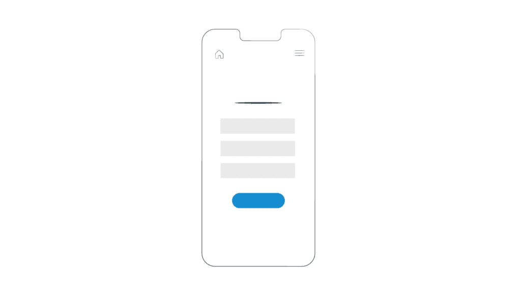
Empty space also referred to as negative or white space in UI design, is the space between elements such as text, images, icons, etc. This modern user interface trend says that the wider the space between those elements is, the better for the user. When the space is wide, contrasts are obvious — it helps users to pay attention to certain details and perceive information without losing their attention to other things.
10. Dark Mode
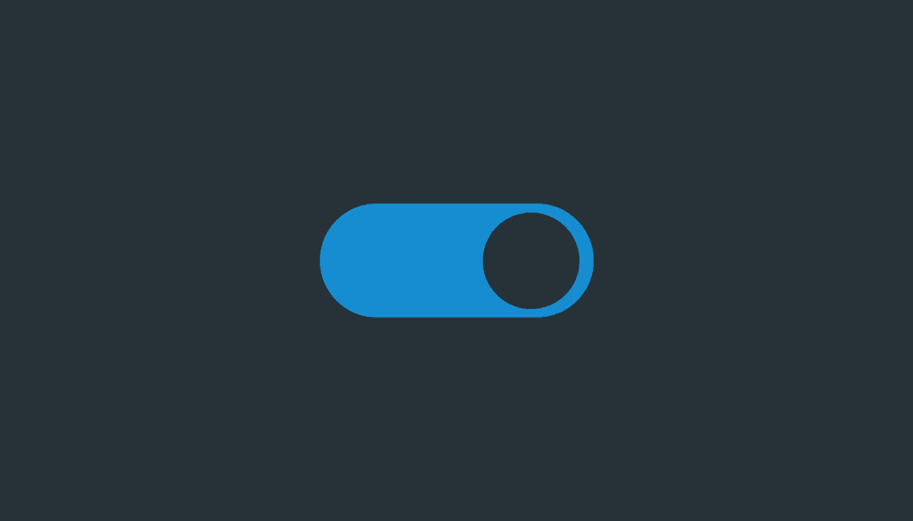
Whether you’ve skipped the goth phase or not, dark mode is something that allures almost to everyone. To say that dark mode has some really nice health benefits for you is somewhat controversial and probably doesn’t have any valid proof so far. But still, it won’t stop gaining its popularity among users in 2025.
Arguably, the dark mode owes its popularity to several reasons:
- The dark mode does not have such a strain on the user’s eyes as the light mode does;
- It also prolongs the battery life of your smartphone;
- The dark mode is easier to use in low-light environments;
- It simply looks stylish.
What is more, in the tech world, the two largest mobile operating systems on the planet have released Dark Theme in Android 10 and Dark Mode in iOS 13.
You can also find the mode in such applications and products as Google Chrome, Mozilla Firefox, Safari, Slack, Facebook Messenger, WhatsApp, Skype, Windows 10, macOS Mojave, just to name a few.
That’s why the dark mode is such a powerful UI trend to follow.
9. Bold Colors
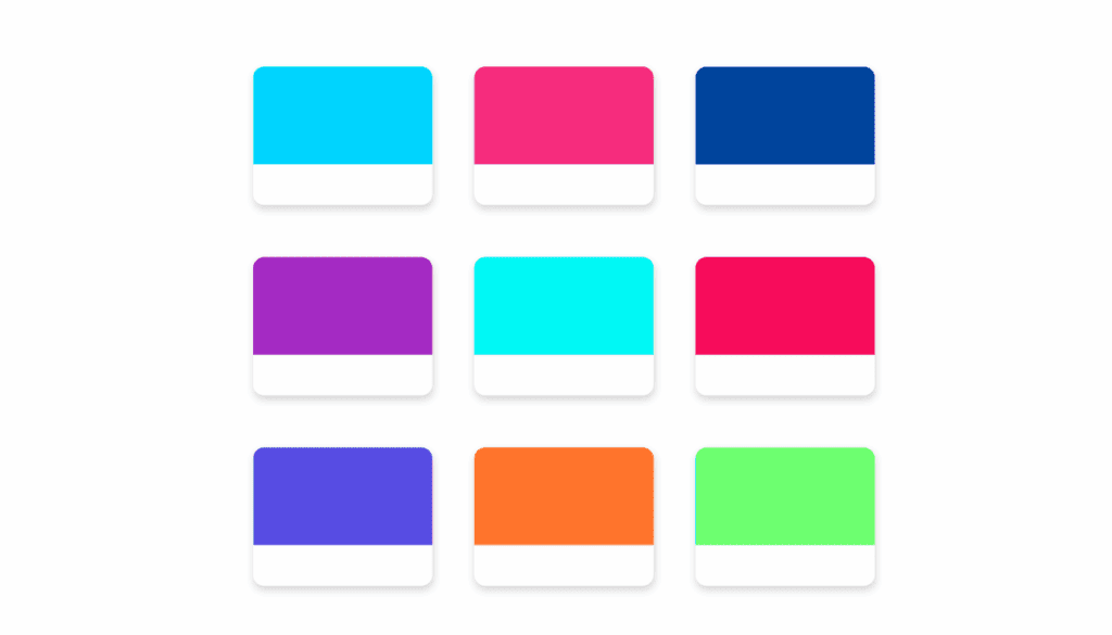
Bold colors are those that are bright, shocking, and vibrant. Rich black, green, yellow, pink, blue, etc., do not only make everything vivid and appealing but also have other positive effects on the user and products. According to Intersog, such colors provide many advantages as they:
- Increase Accessibility, meaning that using bright contrasting colors improves accessibility for people with poor eyesight.
- Enhance Readability and Legibility that provide users with eligible text on the screen of a device and make it distinguishable and visually perceptible. But it should be noted that too contrasting elements can have an opposite effect.
- Create Identity by providing eye-catching, memorable and attention-grabbing visuals that will help your brand to imprint itself on the user’s memory.
8. Neumorphism
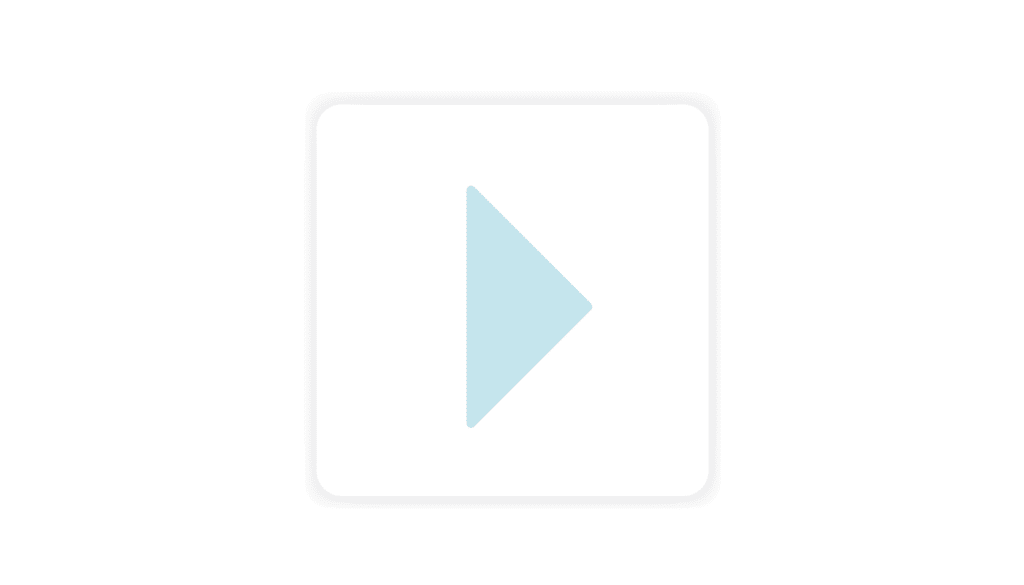
Neumorphism or also known as soft design is just getting started to gain popularity. The word consists of two more words — new and skeuomorphism. The latter means a mimicry of real-life objects in the UI, which the user can interact with as with genuine things. You can find a lot of such examples in software applications.
For example, WhatsApp and Viber use an icon of a handset, Instagram has an icon of an instant camera (or someone might find it as a retro camera.) All of them have concepts that are understandable for users, thus, conveying a broader understanding of what a certain app does.
Neumorphism, in turn, is a UI trend that combines both the skeuomorphism and flat user interface design. It creates an illusion or an effect of extruding from the background. It helps designers make images that resemble real things.
7. Typography Craze
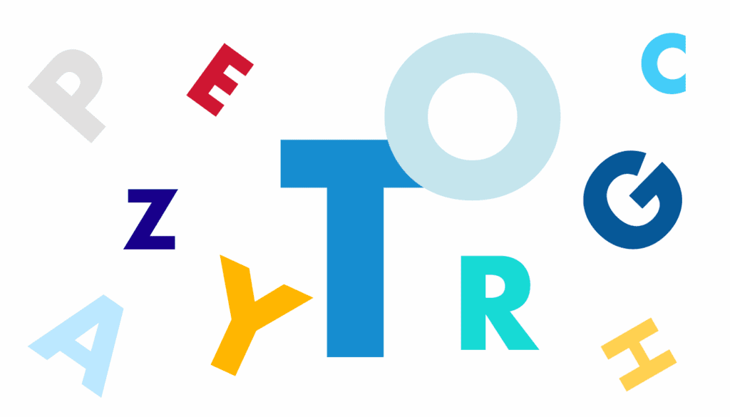
Typography goes hand in hand with design. Crazy, bizarre, strange and sometimes outlandish typography is going to impose its presence on creatives in the IT industry. Convoluted letters embroidered with weird patterns, sometimes misplaced or misaligned. Still, such a hodge-podge of typography creates an interesting and remarkable design that will catch an eye even of a sophisticated user.
6. Motion Design

It’s been around for quite some time, and it doesn’t seem to evaporate into thin air in 2025 either. Motion design or motion graphics user interface design is a process of creating animated text, which is its main element. Moreover, with the help of sound effects, text, and animation, designers can create really remarkable and exceptional products.
When asked what motion design is, what usually comes to mind is how it differs formally from animation: it is typography, abstract shapes, etc. In fact, this formal distinction is more a consequence than a real difference between animation and motion design.
- Motion design – is the production of animated graphics in the user interface design (including characters) to convey certain information to an audience. The video does not necessarily have to entertain, its main purpose is to give information, sell the product, explain the idea. For example, motion design is explaining commercials, infographics, advertisements and film credits.
Motion-design videos are created to deliver a specific message or sale, they are mostly paid for by the owner of the product in question and are performed at his request. Therefore, the budget of such videos is usually lower than in animation, the production time is much shorter, and the client controls and evaluates the production.
5. Animation
With each passing day, UI design are becoming less static and more animated. Movement tells a better story, and storytelling is probably the global, cross-cutting trend around the world today. If you can’t tell a story, you can’t sell it.
Luckily, nowadays, making a motion on the screen doesn’t require any special efforts either from software product creators or from the user. So even novice developers can create UIs with moving elements, and mobile devices up to three years old are quite suitable for their use.
Animation as a UI trend refers to the use of dynamic and interactive elements to enhance the user interface (UI) of websites, applications, and digital products. These components can take many forms, such as scrolling and hover effects, loading animations, or interactive elements that respond to user actions.
Animation has become a popular UI trend in recent years, and for good reason. Animations can make a website or app feel more dynamic and engaging, leading to a better user experience.
4. 2D & 3D UI Illustrations
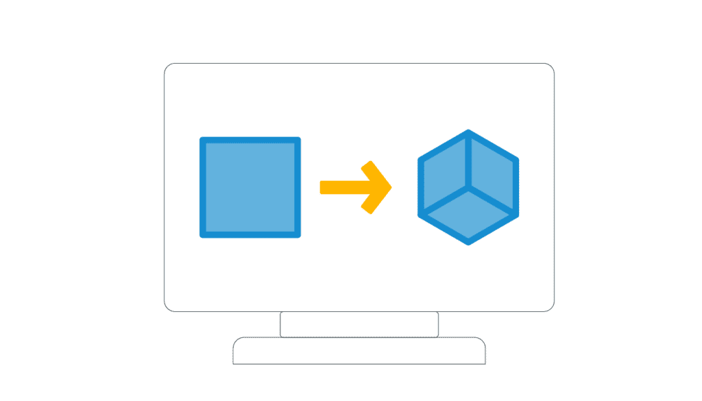
It seems that everyone is dead tired of observing photography and especially stock photos on every website, blog post, or any product. They hardly evoke any feelings. But illustrations are a different matter. With the advent of technology, designers now have a full capability to create 3D depth and realistic illustrations, which convey genuine interest and positive emotions.
The microtrends of this trend are 3D depth and realism and animated illustrations:
3. Animation of Microinteractions
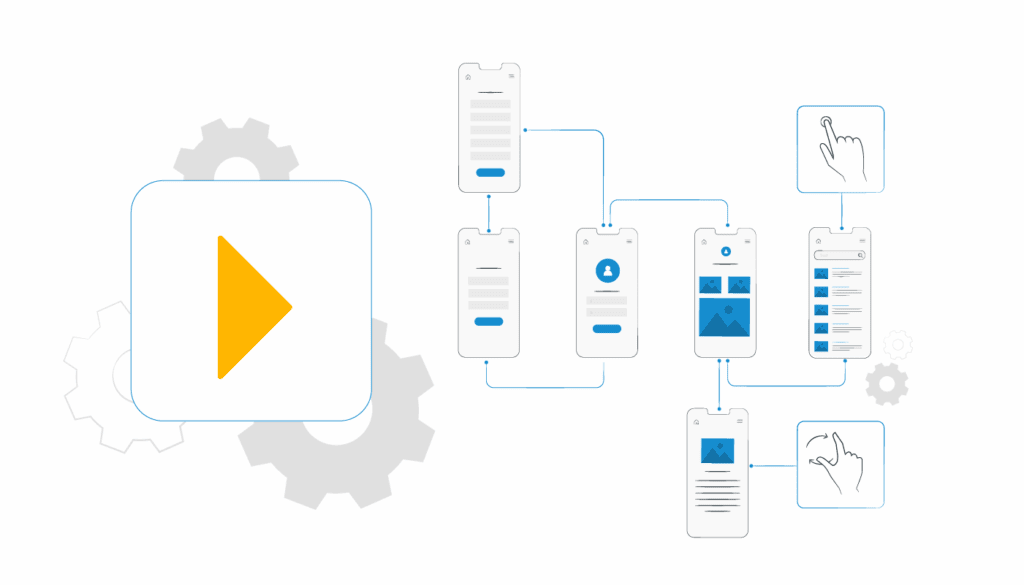
Animation of microinteractions is a UI/UX trend that is going to be enormously important this year. This modern UI design makes it possible for users to enjoy a unique user experience. Thanks to microinteractions, we easily understand how to order a pizza on an unfamiliar site, pay for a subscription, or find customer service.
They are small reactions from the user interface that help us navigate the site or app, directing us to the right action or telling us if something has gone wrong. These are usually visual or sound effects. It’s hard to imagine a modern interface without them – microinteractions are used almost everywhere. If you put the cursor on a button, it can light up, enlarge or change color, so the user knows it can and should be clicked on.
It’s a common way to bring elements of websites and apps to life. When you use Google voice dialing, the microphone icon pulses, letting you know that the app can hear and recognize speech. When you enter a password that is too simple, the form lights up red, signaling that you need to think of another one: as you enter complex characters, the box frame will change color to green.
2. Functionality
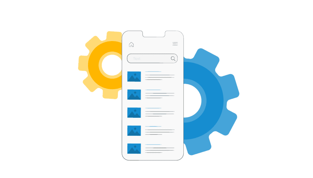
The user interface values the functionality of a product. Every element has its own purpose and it’s created to serve certain functions. Nothing can be random or meaningless in the product.
1. Accessible Design

2025 is the year when designers are going to continue to create UI elements that will be accessible for every person out there. It means that design will become more and more accessible to people with hearing, and visual, impairments, persons with epilepsy, and other conditions. To create such a product that will be inclusive for everyone, designers will have to pay thorough attention to accessibility and inclusive design.
Moreover, a designer needs to comply with various laws and regulations such as ADA, for instance. Americans with Disabilities Standards for Accessible Design state that IT applications must be accessible to people with disabilities.
Wrapping up
User interface design is an integral part of any software application or product. Many of the UI design trends of 2025 will carry over from the previous year but will be better quality with the help of new technologies. The basis should be the introduction of more interactive elements, and it is important to incorporate them into the overall design harmoniously and simply. It is worth noting that the new year 2025 brings a lot of innovations and discoveries, so we can safely call the upcoming period really innovative for the user interface. At the same time, do not forget that the main task of UI design is comfort and convenience for users.
If you want to create an application that incorporates the best UI trends of 2025, contact LITSLINK for high-quality product design services.


