Nowadays, offline education is not the only way to gain the necessary knowledge and skills. The e-learning market has already become an integral part of our reality, and it is constantly growing. According to Statista, during the first quarter of 2020, users downloaded educational apps 470 million times via the App Store and 466 million times via Google Play. Besides the fact that the educational market is highly competitive, it still has enormous potential and can generate sustainable income for years. To beat the competition and gain a strong advantage, you should pay special attention to your e-learning mobile app design. We’ve already written a general article on how to design a user-friendly app, so today, let’s focus on the UI/UX design in e-learning app development.
What Does An Educational App Consist From?
The educational market is estimated to reach $585.48 billion by 2027. It motivates many stakeholders to start working on their applications. To dive deep into the topic, you can check our articles on how to launch an app. Here we’ll study e learning app UI design and identify its essential elements.
-
User Profile
Most people leave the application immediately after a poor experience. Imagine how many customers you’ll lose if you don’t provide a high-quality registration form and a user profile! A personal account is an ultimate part of any e-learning website design or application design. Here customers can:
- Add data about themselves,
- Track the results,
- Adjust privacy settings.
Quick registration is also required for an excellent e-learning UI. Let users get started with Twitter, Facebook, or any other social media account. It will let them save time and get a positive experience right after the first interaction.

-
Social Network Integration
This point isn’t limited only to the registration. People like sharing their success stories on social media, and you should allow them to do so. Especially, as it can help you with the app’s promotion. Sounds amazing, isn’t it? Let people post the results on their social accounts in a few clicks, and you’ll notice a sharp rise in your application’s popularity. Most users trust online reviews, especially if they are from their friends and family. Also, while developing your learning app UI, offer people some bonuses for inviting their friends to the course.
-
Push-Notifications
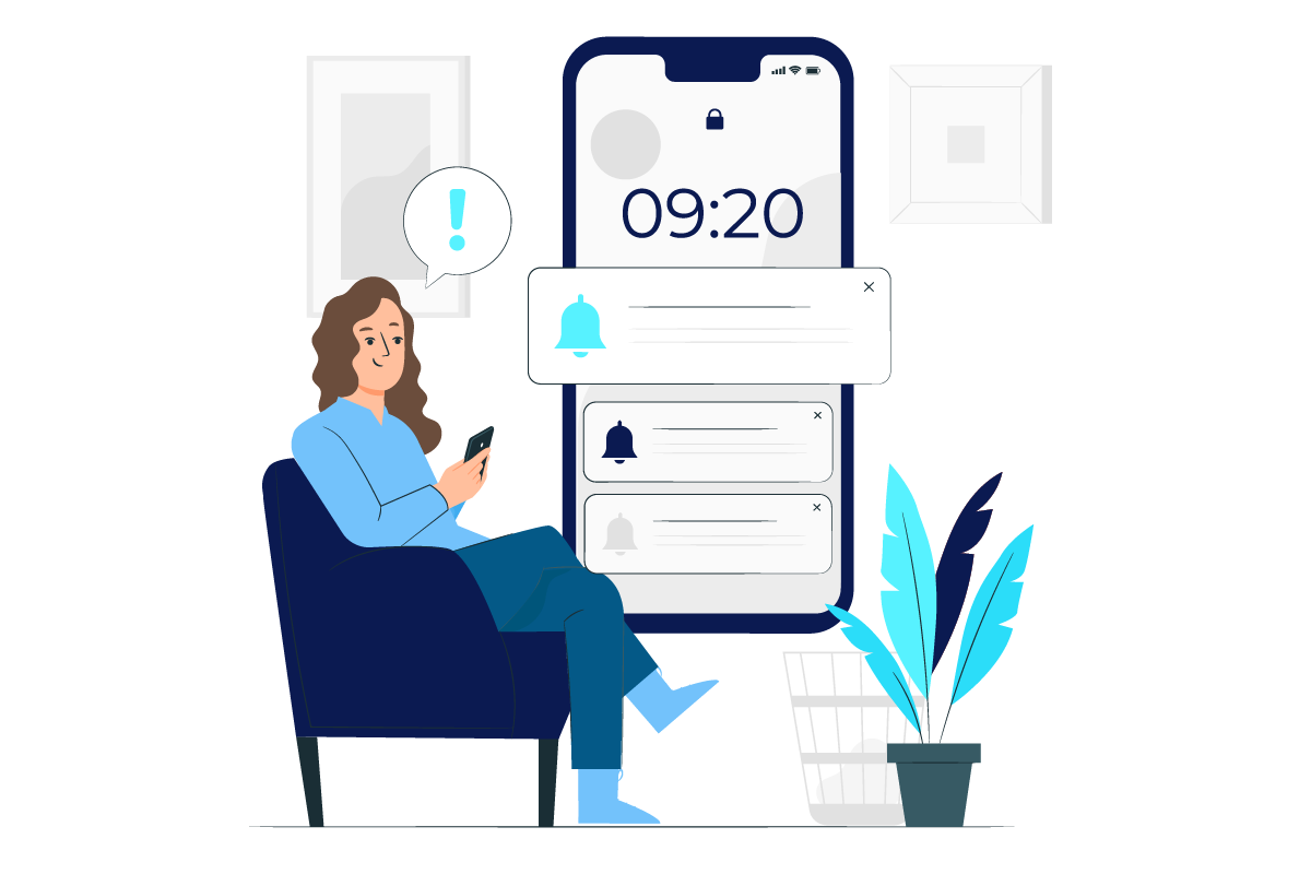
Sending push notifications raises app retention rates significantly. They are required to increase engagement and remind people about studying. By using push-up notifications, you can:
- Notify about unfinished tasks,
- Suggest new courses,
- Offer discounts on paid plans.
Pay attention that your push-up should align with the education app design and not be irritating.
-
Feedback
One of the main reasons why students quit online courses is a lack of live engagement. Your main aim is to remove this obstacle and create a feeling of real communication. There are a few ways to do so:
- Let students track their educational progress and get explanations about completed tasks. It is an extremely critical part of your educational app UI because in such a way people study more about the subject they learn and focus on the process.
- Include users’ reviews in your e-learning app design. Success stories motivate other learners and prevent them from app switching.
Moreover, collecting reviews lets you identify the drawbacks of your elearning UI and fix them to provide better experiences.
-
Library
It’s an essential part of any mobile learning app. Here, students can find more information about the subject and remember previous lessons. Have you ever forgotten the studied material and had to google it? It is no longer necessary with a varied library which includes all the data from the course and additional information for self-studying. This integral part of a well-defined education app UI design will motivate people to use your application for a longer time and expand their knowledge.

-
Scheduling System
E-learning requires less time to obtain the subject compared with traditional classrooms. However, to reach such remarkable results, your application should have a clear-cut educational structure. Once you develop it, implement a scheduling system into your learning app UI, so that users can navigate through the material easily. Breaking the course into subsections will let learners track their progress better and get higher results by studying systematically.
-
Search
Remember that handy and functional e-learning design is a key to success. Eye-catching and attractive style should align with an easy-to-use navigation and search system to let people find any information almost immediately. To make studying convenient:
- Provide materials in different formats.
- Distribute them into levels.
- Add filters to your e-learning UI.

It requires much time and effort to develop a noteworthy application. If you feel stuck with a learning app design, we recommend searching for new ideas and discovering current trends. Continue reading to discover the most important tendencies in UI/UX design that can empower your application.
UI/UX Trends For The Best Experience
While creating design with UX in mind, it is vital to use innovative solutions and make your app more interactive. We’ve already considered general trends in mobile app development, so you can pick up some useful insights from the article. In this section, we’ll focus on learning app design to maximize its performance.
-
Gamification
72% of people say gamification motivates them to do tasks. If it isn’t the reason to implement gaming elements into your app, so what’s it? Cute characters that look happy when users complete assignments will inspire both children and adults. A skillful UX designer can make education easier with quizzes, questionnaires, puzzles, and animations. Provide rewards for finishing the topics, as it will make people proud of themselves. You can also combine gamification with storytelling and create a storyline that consumers will follow when they pass the levels of education.

-
Video Content
Videos are the ultimate trend of the 21st century. They attract maximum engagement on social media and dominate the information space. Dynamic and eye-catching videos can help you explain the topic easily in a relatively short time. While developing your e-learning app design, you can mix formats so that consumers won’t be bored with plain texts and images. Make your characters alive by adding vigorous animation and motivate people to interact with your app again and again.
-
Mobile Learning
Smartphones have already become an integral part of our lives, so it is obvious that app developers started focusing on the mobile learning market. You should make your learning app UI supported on various devices and suitable for different screen sizes. Additionally, consider the peculiarities of consumer behavior you are appropriately targeting at. Mobile learning is about clip thinking, so reduce the number of long texts and unnecessary clicks users should do.

-
Personalized Learning
We recommend identifying the target audience you create your application for and designing it to meet their expectations and needs. In your e-learning app UI design, you should provide a wide range of personalized features. To ensure that information is absorbed the most effectively, make an educational schedule flexible and let users customize it so that it can meet their requirements.
-
Virtual and 3D Reality
VR technologies let people dive deep into the learning process and feel it better at an emotional level. Let users immerse in education by placing them inside the 3D images. The ability to do routine actions will make consumers feel the reality of what is happening. In such a way, in progressive universities, doctors learn to do complex operations and cure people. Make your app design appealing to the audience, easy-to-use and realistic. Remember that some people can’t purchase VR Headsets, so you should necessarily submit a separate 2D format of an application UI design.

-
Microlearning
This term means a short variant of the traditional education we are used to. It can include small pieces of data and little tests to evaluate knowledge. Microlearning is less time-consuming and lets you keep users engaged. Imagine that you can do your assignment while waiting for a bus or standing in a queue in a supermarket. Isn’t it amazing? To optimize your app according to microlearning requirements, divide information into short units. Provide variable content and add mini-tests and quizzes after every assignment. It will help you raise the effectiveness of the education and provide better experiences to users.
Wrapping Up
Modern and stylish design created with UX in mind can help you raise conversions and attract more people to your educational app. Outstanding and innovative developments give you a strong competitive advantage, but remember that everything from e-learning logo design to functional features of the application are critical. Use our guide to build an app that will provide positive experiences to users and help them gain knowledge and skills.


