







Key UI/UX Design Trends in 2026 at a Glance
- The biggest UI/UX design trends in 2026 are AI-driven UX, calm UI, and accessibility-first design — 93% of designers now use generative AI daily.
- Apple’s Liquid Glass (announced at WWDC, June 2025) pushed glassmorphism into iOS 26, macOS Tahoe, and every other Apple OS as a system material.
- The EU’s European Accessibility Act has been enforceable since June 28, 2025 — WCAG 2.1 AA is now a legal floor, with fines up to €30,000 per violation.
- Dark mode is mainstream: over 80% of device users use it at least some of the time, and it saves up to 47% of battery on OLED.
- UX pays: Forrester puts the return at up to $100 for every $1 invested (a 9,900% ROI).
- Bento grids now appear on 67% of top-tier SaaS landing pages.
What’s so special about UI/UX design is that it never sits still. 2025 closed out a big chapter for the web, and 2026 is already rewriting the rulebook — mostly because of AI, mostly because users now expect interfaces to feel almost telepathic. The competition is fierce. Standing out from the crowd of look-alike sites is harder than ever. By 2026, there are well over 1.98 billion websites on the World Wide Web, and mobile owns the room: 62.66% of all global web traffic comes from mobile devices, with roughly 5.81 billion smartphone users worldwide. So how do you make a website that actually earns attention? First things first: make it easy and eye-pleasing, and fill it with the relevant information to describe your vision. That’s not all. Adhere to the UI/UX design trends in 2026. They are, in every sense, the shortcut to leveling up your web design.
Here’s the part most teams underestimate. The UI/UX design market is projected to hit $2.91 billion in 2026 and climb to $11.66 billion by 2031 — a 32% CAGR. And the business case for caring about design has never been louder: Forrester pegs UX ROI at up to $100 returned for every $1 invested (yes, 9,900%). Companies that put design at the center see 32% higher revenue growth and 1.5× faster top-line momentum than competitors who treat it as decoration. Skip the UX work and 88% of users won’t come back after a single bad experience. Numbers like that change conversations in boardrooms.
How Do Design Trends Appear?
Trends are the products of society’s inclinations and moods. To be precise, they are new developments or prevailing tendencies existing in society. Just appearing in the right place, at the right time, at the right moment, and among the right people, a trend can acquire widespread adoption.
Let’s take such a design trend as Art Deco as an example. It appeared in the post-war period, when the atmosphere of luxury and affluence of the roaring twenties was perfectly reflected in this visual arts style. So, the right time and the right people maintained mass appeal to it. UI/UX trends have the same nature. Observing modern society, we can distinguish tendencies ruling this year.
There are many specific UI/UX design trends in 2026 you should know. Let’s check them out!
Top UI and UX Trends in 2026
UI/UX design plays a key role in communicating the business’s vision and values. Living in the age of information overload, we easily get distracted by insignificant things, which only complicates the task of creating an effective interface for UI/UX designers.
While working, employees lose about 86 minutes per day by getting distracted by other things except for their work, and every time it happens, it takes about 15 minutes to focus again. You can imagine how easily our minds start rambling. So, the UI/UX designer’s task is to create such an interface to translate the message of the website clearly.
UI and UX designs are closely connected, but they are accountable for different websites’ functions.
UI or user interface is a compilation of different web elements such as touchscreens, sounds, buttons, screens, pages, visual elements and so on. All these components enable users to interact with the website.
UX or user experience is the full spectrum of impressions the user gets while interacting with a website. It often affects the user’s attitude towards the product or services the website offers. Thus, unable to find the “Contact Us” button, the client will leave the website providing no contact information.
Now, let’s look at UI/UX design trends!
AI-Driven UX Design
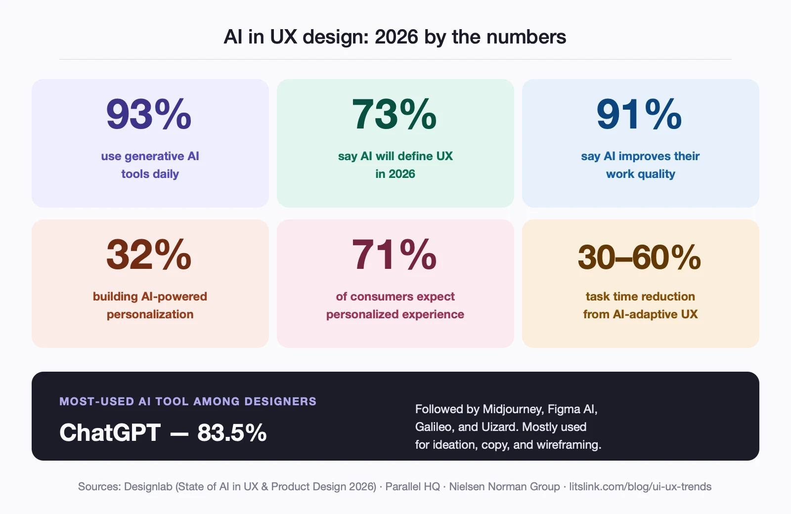
This is the trend reshaping every other trend on this list. By 2026, 93% of designers use generative AI tools daily — ChatGPT, Midjourney, Figma AI, Galileo, Uizard, the list keeps growing. 73% say AI will be the biggest force shaping UX this year. 91% say it improves the quality of their work, and 78% say it boosts efficiency. ChatGPT alone is used more than any other AI tool by 83.5% of designers, mostly for ideation, copywriting, and rapid wireframing.
What’s actually changing in the work? Interfaces that adapt in real time. Layouts, navigation paths, even color palettes shift based on the user’s behavior, device, time of day, or stated goal. 32% of designers are now actively building AI-powered personalization into their products, and AI-adaptive UX cuts user task time by 30–60%. 71% of consumers expect personalized interactions; 76% get visibly frustrated when those are missing.
But there’s a flip side worth saying out loud. Nielsen Norman Group’s State of UX 2026 report makes a pointed observation: “Trust in AI experiences is the new design problem.” As AI agents proliferate — often shipped before they’re ready — human direction and curation matter more, not less. NN/G also argues that UI itself is no longer a differentiator. Anyone with a good prompt can ship a decent-looking interface. What separates winners is strategy, empathy, and the harder-to-fake skill of knowing what to build in the first place.
Quick stats: AI in design (2026)
| Metric | Value |
|---|---|
| Designers using GenAI daily | 93% |
| Designers saying AI will define UX in 2026 | 73% |
| Designers reporting AI improves work quality | 91% |
| Designers building AI personalization features | 32% |
| Consumers expecting personalized experiences | 71% |
| Task time reduction from AI-adaptive UX | 30–60% |
Calm UI & Intentional Design
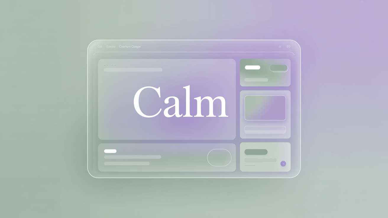
After years of loud-and-bold maximalism, the pendulum is swinging back. Calm UI is everywhere in 2026 — and it’s not minimalism wearing a different jacket. Calm design is about reducing visual noise on purpose: larger type, softer edges, more breathing room between elements, muted palettes, careful contrast. Frosted blur shows up too, but as a focus tool, not flair.
A lot of this is being driven by neurodiversity awareness. Reducing sensory overload helps users with ADHD, ASD, or sensory sensitivities — and it turns out, it helps everyone else too. Apple’s Health app uses frosted blur to pull attention to the metrics that matter without overwhelming you with the rest. Envato’s UX/UI design trends 2026 report puts it well: “Calm design becomes a competitive advantage, with more teams asking for restraint, clarity, and emotional intelligence.”
Is your interface trying to do too much? That’s the question to keep asking in 2026.
Inclusive Design
Inclusive design is a design approach that considers the needs of all users, including those with disabilities, different ages, and cultural backgrounds. This UX trend emphasizes the importance of designing products that are accessible, usable and enjoyable for everyone.
Being more than just a UX design trend, accessibility helps individuals from different backgrounds navigate a website and attract more clients. You can’t even imagine the number of people who rely on this functionality — 20% of general internet traffic comes from people with special needs.
How to achieve better inclusive design and accessibility? Contrasting colors, large texts, clean-cut imagery, keyboard navigation, adding alt text to images, effective UX writing, and so on are the way to make website navigation more inclusive.
The legal stakes just got real
Here’s what changed in 2025–2026 that every product owner needs to know. The European Accessibility Act (EAA) came into force on June 28, 2025. It applies to every private-sector business selling to EU consumers — e-commerce, banking, telecoms, transport, ticketing — regardless of where the company is headquartered. The compliance bar is WCAG 2.1 Level AA, codified in the EN 301 549 standard. Miss it and you’re looking at fines up to €30,000 per violation, plus your product can be banned from the EU market.
The U.S. picture isn’t softer. ADA-related lawsuits cleared 4,600+ filings in 2025 — up 14% year over year. Accessibility-first isn’t a nice-to-have anymore. It’s a legal exposure question.
If you’re auditing your product, the four WCAG principles (POUR) are the place to start: Perceivable, Operable, Understandable, Robust. Keyboard navigation, color contrast above 4.5:1 for body text, alt text on every meaningful image, captions on video, ARIA labels where semantic HTML can’t carry the load. None of this is glamorous work. All of it is now table stakes.
Bento Grid Layouts
Bento grids took over in 2025 and they’re not letting go in 2026. The name comes from Japanese bento boxes — modular, asymmetric, with compartments of different sizes packed neatly together. Apple’s product pages made the layout famous; now 67% of top-tier SaaS landing pages have adopted some version of it.
Why does it work? It matches how humans actually scan. Eyes land on the biggest tile first, then jump to adjacent blocks. A bento grid gives content a built-in hierarchy without forcing users into a single linear path. Sites using bento layouts report higher dwell time, better click-through rates, and stronger information retention.
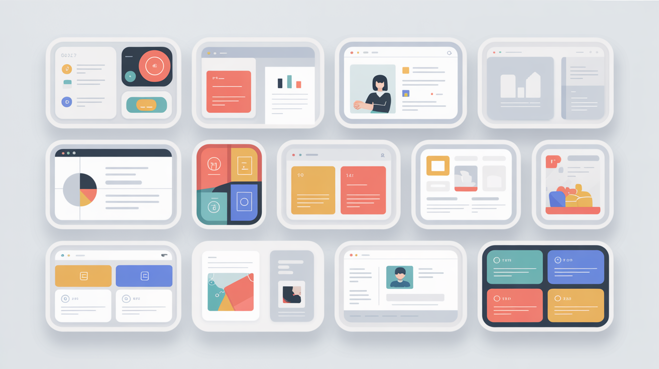
The 2026 twist is “active grids” — bento tiles that respond when you hover. Some expand, some play short loops, some reveal a second layer of data. Stripe, Linear, and Vercel are all running variations of this pattern on their marketing pages. Done well, it feels like an interactive product tour disguised as a landing page.
Glassmorphism & Liquid Glass
Glassmorphism — the frosted-glass UI style — got a serious upgrade in 2025. At WWDC on June 9, Apple announced Liquid Glass, a new design language baked into iOS 26, macOS Tahoe, iPadOS 26, watchOS 26, and tvOS 26. It treats glass not as a flat texture but as a system material that responds dynamically to motion, depth, and context. Surfaces ripple when you tap. Modals refract the content behind them. The whole OS feels lit from within.
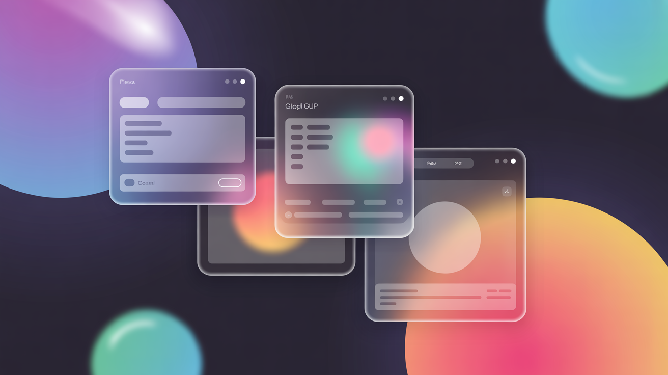
The web is catching up fast. Nike’s After Dark Tour campaign site is a benchmark — glassmorphic panels create depth and hierarchy without competing with the photography underneath. Search interest in “Liquid Glass” peaked in March 2026 at a normalized value of 100, meaning peak consumer awareness.
A word of caution: this style is dessert, not the meal. Use it for modals, tooltips, sticky headers, dashboard overlays — places where a sense of layered depth helps users orient themselves. Plaster it across an entire interface and you’ll exhaust the user inside two minutes.
Dark Mode
At the heart of this UI design trend is the dark-colored interface with a black or dark gray background. It emerged as a response to rising concerns over increasing screen time. Dark mode is proven to reduce eyestrain, ease headaches, improve work focus, and save battery life. And the numbers in 2026 are striking: over 80% of device users now use dark mode at least some of the time. 82% of mobile users actively prefer it. After 10 p.m., 82.7% of users switch over. On OLED screens, dark mode saves up to 47% of battery.
That doesn’t mean light mode is going anywhere. There’s an important nuance worth flagging: 55% of users still prefer light mode in educational apps and financial dashboards, where readability and precision rank above ambiance. Context decides.
Tech giants — WhatsApp, Instagram, Google, Apple, Reddit, X (formerly Twitter), YouTube, and Facebook — have all implemented dark mode. At this point, shipping without it reads as an oversight rather than a stylistic choice.
Extended Reality
Extended reality continues to shape digital product design in 2026. AR and VR can turn passive browsing into spatial interaction, allowing users to preview products, explore places, and engage with 3D content through browsers, mobile devices, or headsets. The pandemic accelerated demand for remote and immersive experiences, but the pattern has outlasted that moment.
Industry events such as GDC bring the global game community together through talks, workshops, panels, and interactive sessions. For designers, these formats demonstrate how digital experiences can encourage participation rather than simply deliver content. The same principle applies to virtual museum tours, exhibitions, and product demonstrations.
IKEA has taken a practical approach to this trend by incorporating AR technology into its customer experience. Playful effects may attract attention, but useful AR—such as showing how a piece of furniture will fit in a room—demonstrates the technology’s clearest UX value.
Activism and Health
Environmental and social responsibility are no longer niche themes in product design. Users increasingly expect digital products to communicate their values clearly, support ethical initiatives, and make sustainability information easy to understand.
As concerns grow around manipulative technology, privacy, and resource use, designers are creating safer and more transparent experiences. Clear consent controls, humane engagement patterns, and awareness of the digital carbon footprint are becoming part of responsible UX.
The COVID-19 pandemic accelerated digital health adoption, but wearables, telemedicine, and AI-assisted care are no longer temporary emergency solutions. In 2026, the design challenge is to make these services trustworthy, accessible, private, and easy to use across the full care journey.
Multimodal & Voice Interaction
Voice UI used to be the punchline of a 2018 trend deck. Not anymore. By the end of 2026, an estimated 157.1 million Americans will use voice assistants, and 62% of U.S. adults already use them on devices they own. The Multimodal UI market itself jumped from $20.65 billion in 2024 to $24.29 billion in 2025, and analysts project it’ll cross $123.11 billion by 2035 (CAGR 17.62%). VUI alone is on track for $41.8 billion by 2035.
The bigger shift in 2026 is the word “multimodal.” Voice has stopped trying to replace typing and started complementing it. Gartner expects 70% of customer interactions to involve voice assistants or computer vision by the end of this year. The interfaces that win are the ones that let users hop between touch, keyboard, voice, and gesture without making the user think about which mode they’re in. Context-aware, not mode-locked.
If you have used any of the Amazon, Google, or Apple products, you are already acquainted with this pattern. Order a taxi by saying “Hey Google, I need a ride.” Dictate a search query instead of typing it. Ask your watch to start a workout. Each handoff between input types should feel invisible — that’s the design problem worth solving in 2026.
“Voice is a new way of interacting with technology, and now, many try to save a lot of user steps and eliminate the requirement for a graphical user interface,” says Evgeniia Liuts, Head of UI/UX Department at LITSLINK, “You can order a taxi through speaker saying, ‘Hey Google, I need a ride,’ and you’ll get a car. Those things make our lives easier.”
Emoji
Emojis have evolved from simple emotional cues into a familiar part of interface language. In 2026, they appear in reactions, status indicators, onboarding, notifications, and branded micro-interactions. They work best when they reinforce meaning rather than replace clear labels.
A custom emoji or icon set can give a product a more recognizable voice, especially in social and community features. Designers should use these elements selectively and test them for accessibility, cultural interpretation, and consistency across platforms.
Earlier social media guidance from WordStream and a 2017 Quintly study helped popularize emojis in branded content. Quintly reported 47.7% more average interactions for Instagram posts containing at least one emoji in its dataset. Because these findings are platform-specific and several years old, treat them as historical context rather than current performance benchmarks.
“I guess we’re used to expressing emotions with the help of emojis in online communication. To evoke a more emotional response, web designers hype the interface with emojis, thus attracting more attention.” — Evgeniia Liuts, Head of UI/UX Department at LITSLINK
Spatial Computing & 3D UI
Apple Vision Pro shifted design thinking from screens to space, and 2026 is the year that shift hit web and product design seriously. At WWDC 2025, Apple announced visionOS 26 — spatial widgets that snap to walls and tables, 3D models embedded directly inside Safari web pages, persistent apps that remember where you left them in physical space across sessions, and hand tracking at 90Hz.
What does this mean for designers who don’t work on visionOS? Two things. First, 3D web embedding is real now. You can drop a 3D model of a product into a regular web page and let users rotate, inspect, and place it in their environment. Shopify’s AR Quick Look adoption tripled through early 2026. Second, the design vocabulary itself is changing. Modifiers like rotation3DLayout, depth cues, and hover-at-distance interactions are entering the same conversations as padding, margin, and z-index.
You don’t need a headset to design for this future. You do need to start thinking in dimensions, not just layouts.
Animation & Micro-Interactions
Animated words, a full-screen video, a background image — animated elements in web and app interfaces magically keep the user’s attention for a bit longer than just bare information does. But in 2026, the story is less about hero animations and more about the small stuff. Gartner projected that by the end of 2025, 75% of customer-facing applications would treat micro-interactions as a standard UX practice — not a bonus. That prediction has largely held.
The data is hard to argue with. Adobe found that websites with subtle motion elements see a 12% higher click-through rate compared to static counterparts. Micro-interactions can boost user retention rates by up to 400%. The flip side: without effective micro-interactions, fewer than 5% of users remain engaged with an app after one month.
Microinteractions are small moments of user and design interaction. For instance, when you tap twice on someone’s photo on Instagram, an animated heart icon appears on your screen. These elements in your UI, where they are appropriate, would breathe refreshing vibes into it. Building up an interface’s unique temper and aura, they have one task — to delight and engage users while confirming actions, providing orientation, and quietly reducing errors before the user even notices them.
Minimalism or Maximalism Extremes
In 2026, we still aren’t going for a happy medium in web design. Sticking to average is not our case. Way more trendy is either minimalism or maximalism. Minimalism hooks with its simplicity and elegance, eschewing excess elements. When applied properly, it boosts user experience. A minimalistic interface proves to be the best interface, as it makes navigation intuitive and helps the user reach their goal.
The maximalist UI design trend allows experimenting with font variation, overlapping visuals, floating elements, and all the excesses. In the spirit of brutalist websites, it looks loud and bold. The hottest variant of this in 2026 is Neubrutalism — thick black borders, jarring color blocks, raw type, and zero subtlety. Brands like Gumroad, Figma’s Config event sites, and a wave of indie SaaS landing pages have built whole identities around it. The trick is keeping the chaos intentional. Some web designers use bright colors, disorienting patterns, odd cursors, and unnecessary animation, which in the end, looks like a dwarfy design from the 1990s. But behind all of its ugliness, there is an artistic hint.
Skeuomorphism
Among UI trends of 2026, skeuomorphism is one of the most impressive ones. This is a design style that mimics the physical world by using real-world objects and textures in digital interfaces. The trend has been declining in popularity for years, as more designers opted for flat designs — but Apple’s Liquid Glass push has quietly given skeuomorphism a second life. When system materials respond to light and motion, you’re back in the territory of mimicking the physical world. Just with better technique.
Skeuomorphism is the play with hyperrealism, shadows and volumes to achieve such authentic results. Aiming to show the volume of objects, web designers experiment with light, shadows, textures, and flares. As a result, it looks enticing and eye-pleasing.
It is easy and fun to interact with skeuomorphic elements as they are familiar to users because UI designers use concepts that they recognize. For instance, the recycle bin icon on Windows is what successfully fulfills mimicking real life in both appearance and function. (See skeuomorphism in motion.)
3D Icons & Illustrations
As you’ve noticed with the previous UI/UX trends, 2026 is definitely the year of design. 3D icons and illustrations keep climbing the trends chart. And why not? Deep, innovative, and imaginative, 3D objects may glue you to the screen and grab your attention in several seconds.
Web designers may strive to add more and more 3D icons and illustrations on their websites and look for free illustrations on the web, which is obviously the wrong way. To stand out from the crowd, come up with your own graphic ideas, and you will see users will love them. This UI trend wins users’ hearts because people are fond of visually appealing images that remind them of real objects. In this way, websites with 3D illustrations have more opportunities to create a captivating environment where users stay longer.
Typography
Since web design refuses to remain stagnant, adding some unparalleled typography tricks can help your website stand out from the crowd. Playing with different fonts can make your website look truly eye-pleasing.
Adding some creativity to your design might enable you to experiment and play with forms and structures. In order to implement this UI trend, you can customize fonts according to your needs, making them bold and loud, minimal sans serif, hand-drawn, animated, 3D or colorful.
The 2026 twist is variable fonts. A single font file now ships with axes you can tune in CSS — weight, width, slant, optical size — without loading separate woff2 files for each variation. The performance win is real, and the creative ceiling is higher than anything static type ever offered. Type-only “no image” hero sections are also having a moment: think Vercel, Stripe Press, Linear’s changelog. Letters as the visual.
Bold typography may provide a set of advantages to your brand:
- The website looks dynamic and eye-catching.
- Typography enables UI/UX designers to experiment and show their creativity.
- Variable fonts cut page weight without sacrificing range.
Also, do not be afraid of lacking balance because asymmetric does not mean chaos. To gain harmony in design, conceptualize each item’s weight, color, size, and movement of the elements on your page, and how it would look.
Pastel Colors & Earth Tones
Pastel is still a contender in 2026, but the palette has broadened. Earth tones — terracotta, sage, sand, deep ochre — are showing up everywhere alongside the muted pastels that ruled the last few seasons. Both share the same goal: ease on the eyes, gentle, soothing, nurturing.
In the midst of minimalism’s flurry and the rising calm UI movement, soft palettes get in sync with everything else. They imbue a website with lightness and simplicity. Creating pastel colors is also effortless: just make the background and watermark bright but faded in accordance with the general concept and graphics of a website.
However, be mindful that this UI design trend is not good for every industry. It works perfectly in cosmetics, fashion, and personal care. It may seem off in finance or utilities — though earth tones do bridge that gap reasonably well in fintech apps targeting younger demographics. You need to pay attention to what emotions you want to evoke in people when they visit your website. Businesses like finance aim to create a trusting but also stimulating atmosphere, so brighter or deeper colors are often more appropriate.
Gradient
This UI design trend is not a newbie in the world of web design. But in 2026, the gradient effect should be more airy and light and add volume to fit the trend. Linear gradients alone are tired. What works now: mesh gradients (Stripe’s homepage is the textbook reference), liquid gradients that animate slowly in the background, and color-blur effects that feel like they’re lit from underneath the page.
With the combination of 3D icons and mesh gradients, an interface acquires depth and volume, and a website morphs into a truly agreeable eyeful. This eye-catching UI trend can enhance any design and help a website or app stand out from the competition. Pair it with glassmorphic panels and you’re sitting on the dominant visual language of 2026.
Hyper-Personalization
One more thread worth pulling out on its own. 71% of consumers expect personalized interactions — that number has barely moved in three years — but the way we deliver personalization has changed completely. In 2026, it’s less about “Hi {first_name}” in the headline and more about layouts and content blocks that rearrange themselves based on what each user actually does. AI handles the decisioning. Designers handle the rules of engagement: what’s allowed to change, what should never change, and how the user keeps a sense of control over what they’re seeing.
The cost of getting this wrong is steep. 76% of users get frustrated when personalization is missing or clumsy, and 32% will leave a brand after one bad experience. The cost of getting it right? Up to a 200% conversion boost from usability improvements, and up to 400% from fully optimized UX.
Implement The Best UI/UX Trends To Boost Brand!
These are just a few of the many UI and UX design trends that are shaping the design world. It’s important to keep in mind that trends are constantly evolving, and designers should be flexible and open to new approaches and technologies.
With the help of the latest design trends, making interfaces even more user-friendly and appealing is easy. If you are aiming for perfection, stick to general guidelines for now. Concentrate on an excellent user experience, develop a more elegant and seamless UI and increase overall usability.
If you want your brand to stand out from the crowd, our team of skillful designers will provide stunning app design services tailored to your needs and goals, based on the latest UI and UX design trends. Contact us!
Frequently Asked Questions
The most important trends in 2026 are AI-driven UX, calm UI, accessibility-first design (driven by the European Accessibility Act), bento grid layouts, Apple’s Liquid Glass design language, spatial computing, multimodal interaction, and micro-interactions as a standard practice rather than a bonus.
93% of designers now use generative AI tools daily. AI shifts day-to-day work toward ideation, rapid wireframing, and adaptive interfaces that change in real time based on user behavior. It also raises the bar — Nielsen Norman Group argues UI alone is no longer a differentiator, since AI can produce a competent interface from a prompt. Strategy and empathy are now the differentiators.
Yes. Over 80% of device users use dark mode at least some of the time, 82% of mobile users prefer it, and it saves up to 47% of battery on OLED screens. Light mode still wins in contexts where readability and precision matter most — education, finance, and healthcare apps.
The EAA came into force on June 28, 2025. It requires private-sector businesses selling to EU consumers to meet WCAG 2.1 Level AA standards. Penalties run up to €30,000 per violation plus potential EU market bans. It applies regardless of where a company is headquartered, which is why accessibility-first design is now a global compliance issue, not a European one.
Forrester estimates up to $100 returned for every $1 invested in UX. Companies that put design at the center see 32% higher revenue growth and 1.5× faster top-line growth than competitors. 88% of users won’t return after a single bad experience — so the cost of neglecting UX shows up directly in churn and acquisition spend.
A bento grid is a modular, asymmetric card-based layout inspired by Japanese bento boxes. Tiles of different sizes pack together to create visual hierarchy without forcing users into a linear scroll. 67% of top-tier SaaS landing pages now use some version of it. Apple’s product pages are the most-cited reference example.