React Native is a perfect tool used for creating beautiful and high performing mobile applications. Moreover, the framework provides you with an excellent chance to create appealing components for your app such as animated custom tab bars. In this short article, I’m going to show you how you can build a custom tab bar with no effort.
The animation of a tab bar you’ll see below is simple, yet a standard grid of react-navigation doesn’t allow us to build our own animation similar to this one. Nonetheless, it inspired me to create my custom tab bar.
Here are the main steps that you need to undertake to build a React Native tab bar for tab navigation.
General
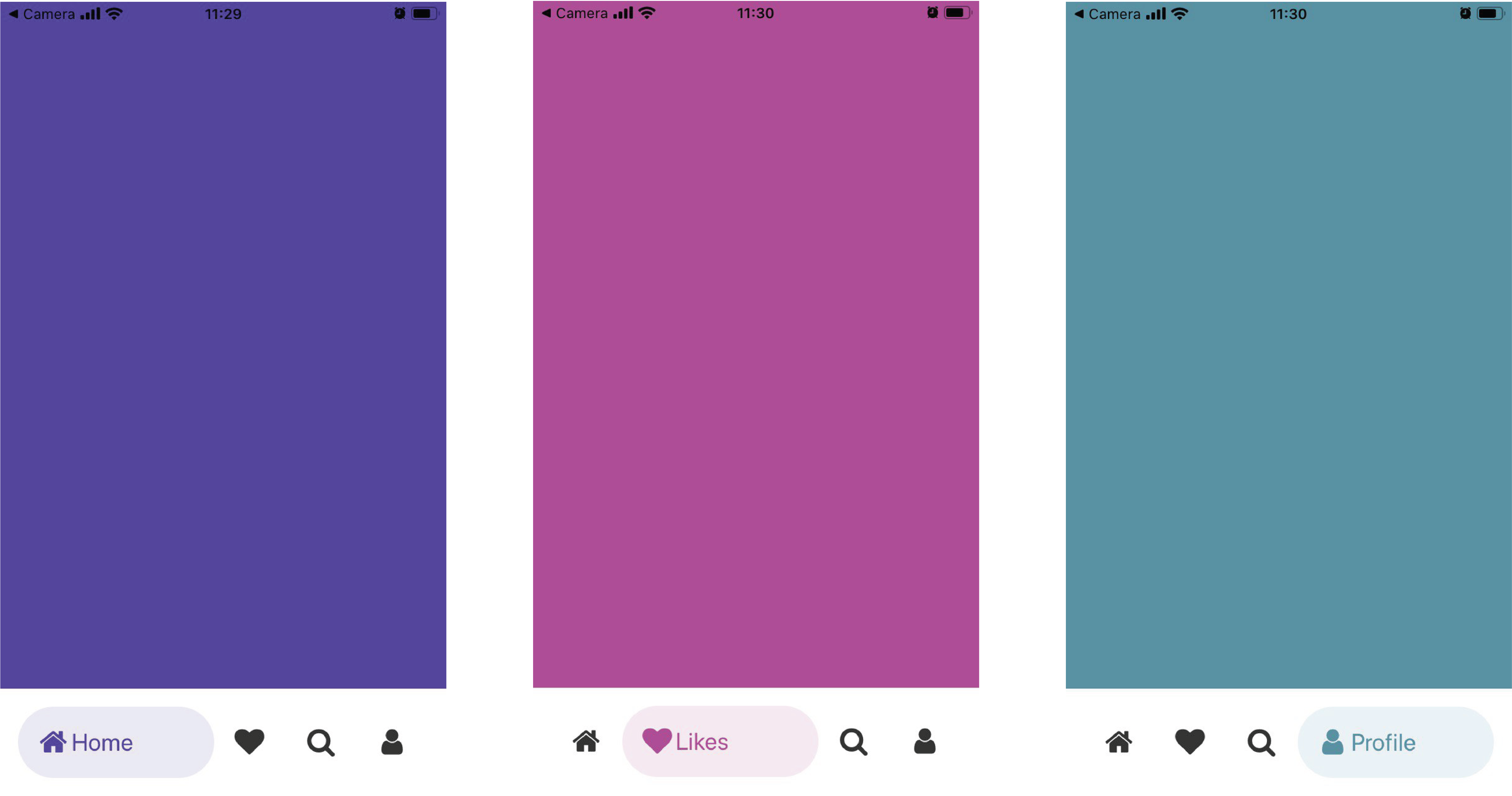
To create the React Native navigation bar like the one on the image, we need to have a container with items. Each item must have a background color, rounded corners, vector icons, and a label, which appears on the selected state.
When the user selects an item to have a related tab view, the tab label moves horizontally from the tab icon. Its opacity increases from zero to 1. Also, the size and background color of the selected tab changes during the animation.
In general, to make this effect in your tab bar, we need to use the flex-grow property for the tab bar container and manage the size of a tab text element.
Building Tab Bar Structure
To simplify the process of building my own tab bar, I decided to avoid using libraries like “react-navigation” and built a custom component for this purpose.
First of all, I created a container and placed it to the bottom of the screen and flex-direction: row. Then I added four child views with flex-grow: 1 into the container, which allows items to grow with needed space when an item is selected, and a label appearing like it is demonstrated on the image above.
Building Tab Bar Item
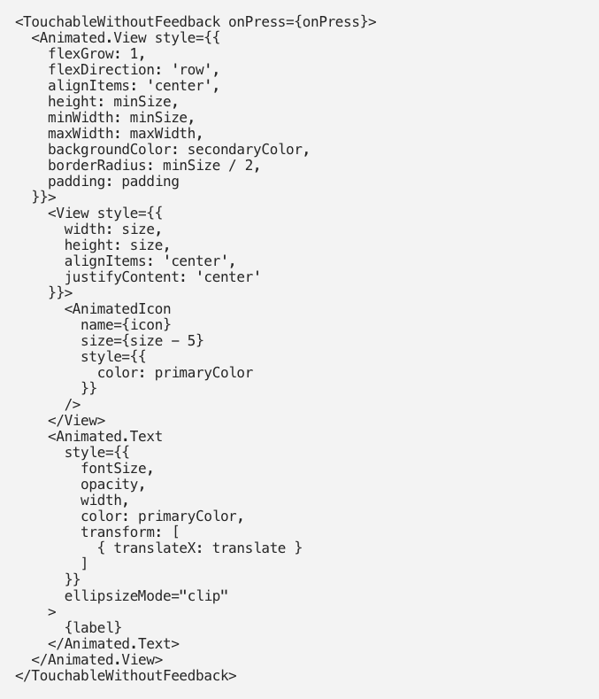
To handle the tab bar item selection, I decided to use TouchableWithoutFeedback to avoid visual effects if it covers the whole component.

The main container “Animated.View” is used to apply background color animation and round corners of a tab bar item. For the icon, I’ve created an animated component using vector-icon to animate color alongside with tab bar background. The label text component “Animated.Text” was enabled to animate text color and position.


Now you know how to create a React Native custom tab bar simply and easily. But to create the first-grade tab, it’s better to ask for help from professionals such as LITSLINK. We provide a wide range of top-notch IT development services, and we know all the angles of React Native. Don’t hesitate and contact us to develop a splendid React Native custom tab bar for your app!


