





Building a Health Community App for People with Similar Diseases
- 3 platforms delivered: iOS, Android, web
- 3 user roles supported across mobile and web
- 50 WCAG 2.1 AA success criteria audited before store submission
- 50K+ downloads on Google Play
LITSLINK built a health community app for people living with the same diagnosis, a place to swap health stories and find support from someone who has already been through it. The app runs on iOS, Android, and the web, and every screen meets ADA requirements, so users with disabilities are part of the conversation from day one.
Project Details
The client came to LITSLINK with one premise: people managing the same condition should be able to reach each other directly, without a general feed sitting in the way. We handled business analysis, product design, and development of four connected products covering iOS, Android, desktop web, and internal moderation, with three user roles running across them.


Business Challenge: Health Community App Development That Builds Real Connections
A person who gets a diagnosis on a Tuesday spends Tuesday night looking for someone who has already had it. What they usually find is a general network where the audience is coworkers and cousins, or a forum thread from 2013 with no moderator and no mobile version. The client had watched that pattern up close and wanted an app built for one job: connecting people around a shared condition, on the device they already carry.
Two constraints shaped everything after that. The first was privacy, because health concerns do not belong in the same feed as vacation photos. The second was access. An app for people managing chronic conditions has to work for someone using a screen reader, so ADA compliance went into the scope before a single screen got designed.
Underneath both sat a product challenge. A community app lives or dies on whether the first ten minutes produce a person, so the team had to decide early which features earn a place in release one and which ones wait. Anything that pulled focus away from finding another member with the same diagnosis got moved down the list. A second challenge was volume: health support communities fill with duplicate rooms fast, so community management tools had to ship in release one instead of arriving after the mess.

Privacy-First Health Discussions
On a general network, a post about treatment reaches relatives, coworkers, and an algorithm. The client wanted health stories kept inside a community that understands them, with per-account control over who sees a profile and who can message it.

ADA-Compliant Social Features
Accessibility usually arrives after a complaint. Here, screen-reader labels, contrast ratios, captions, and touch-target sizing had to hold across every social feature in the first release, on four platforms at once.

Cross-Platform Community Building
A community splits when the phone app and the website behave differently. Feed, chats, and profile data needed to match everywhere, which meant one API serving mobile and web instead of two codebases drifting apart over time.
Technologies Behind the Health Community App

Our Health Community App Solution
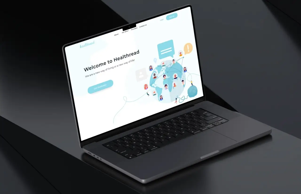
The app runs as one system with four faces. React Native covers iOS and Android from a single codebase, a React.js web app gives the same account a desktop home, an admin panel sits behind both, and a mobile-optimized landing page handles download traffic. All four talk to a Ruby on Rails back end over GraphQL, which is what keeps a comment posted on a phone identical to the comment loading in a browser two seconds later. Teams creating something similar can hire React Native developers who have shipped this pattern before.
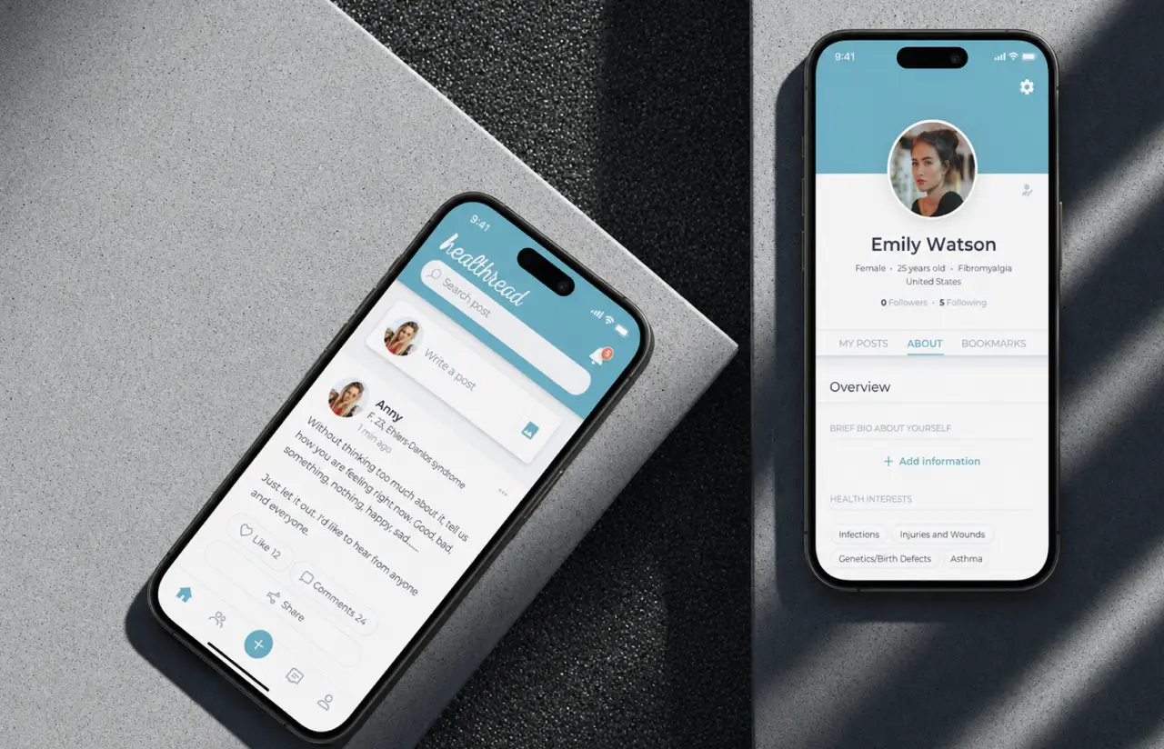
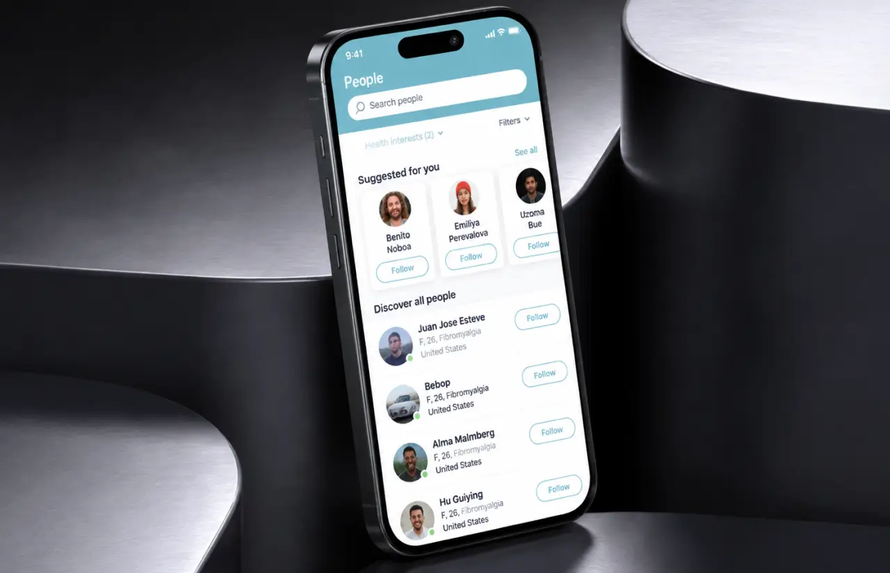
Matching is the part that makes a social media app development project worth opening twice. Onboarding collects conditions, health interests, age, gender, and location, and search runs against that profile, so users looking for people with the same chronic conditions get people rather than articles. Firebase carries push and event-based notifications, allowing users to keep a thread going without sitting inside the app all day.
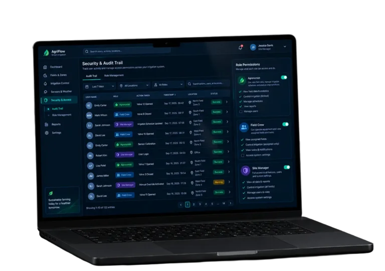
Three user roles run on one permission model, allowing users to move between phone and browser on one account. Members see the same health data and the same social features either way, while admins work in a separate panel for community management: reports, member records, and the moderation practices that keep a health discussion usable. Keeping those controls out of the member app mattered here, because many of these users navigate by screen reader and every extra button is one more thing to hear.
Support works on two levels. Members find support from each other in group chats and direct messages, and an FAQ section plus a route into the support service covers the rest. Notifications add convenience for anyone who checks in once a day.
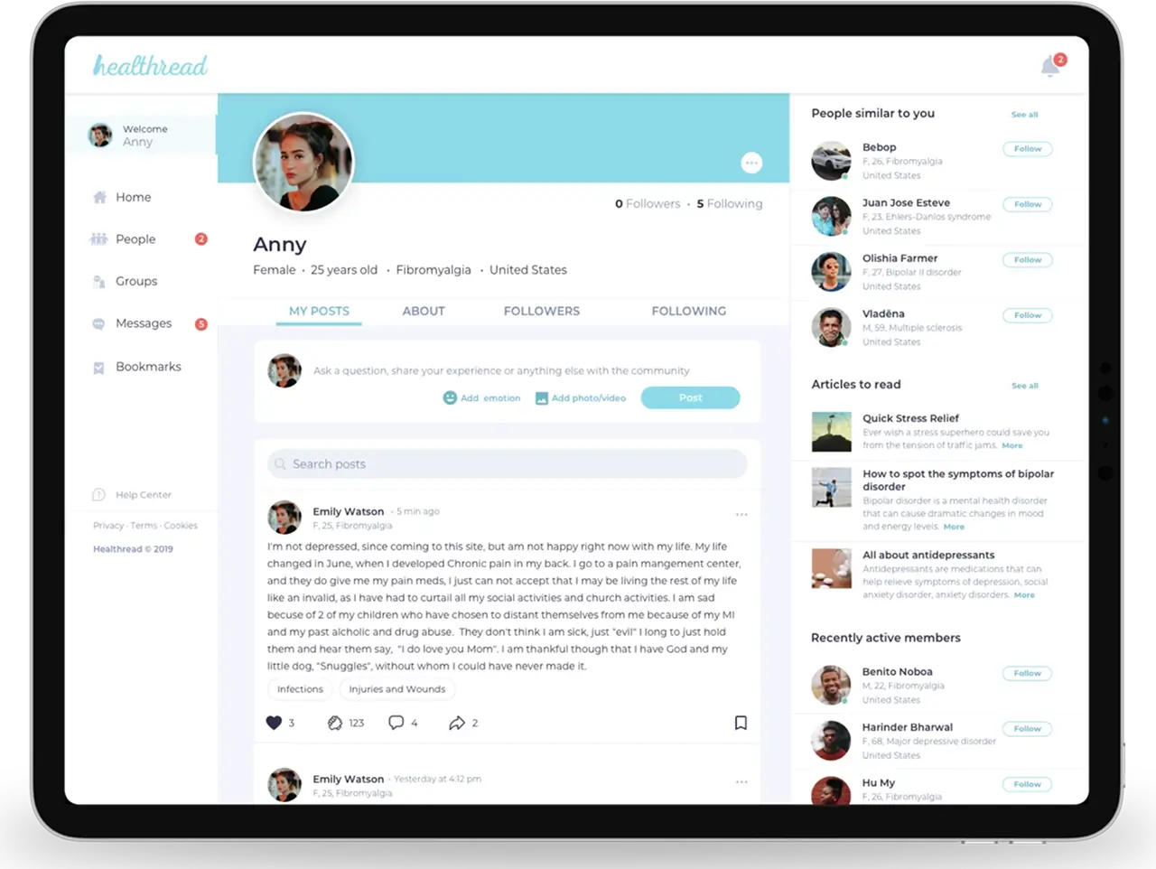
The web app handles what a phone handles badly. Long posts and profile management go faster on a keyboard, and members have settled into reading on mobile and writing on desktop. Both surfaces run the same GraphQL queries, so a draft survives the switch. Splitting user engagement across two screens was the plan.
Accessibility runs underneath all of it. The team worked through WCAG 2.1 AA screen by screen: 4.5:1 contrast on body text, labeled controls, captions on media, and touch targets no smaller than 44 points. Close to 40% of QA time in the first three sprints went to accessibility alone.
Guided onboarding and profile setup
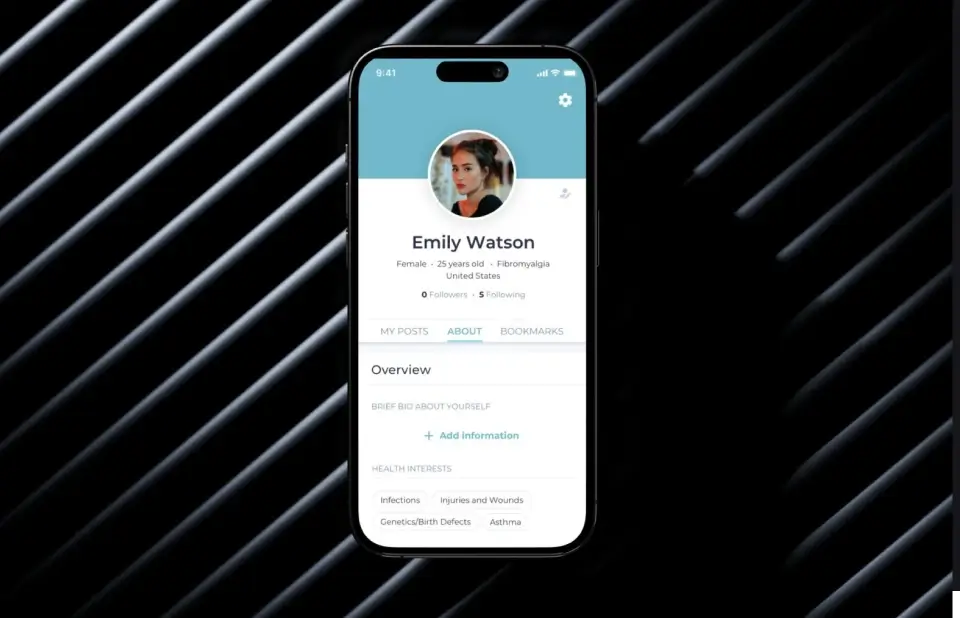
Registration with SMS verification, then a step-by-step flow capturing conditions, health interests, age, gender, and location across roughly 20 data points. That profile is what every later match runs on, so the team has tracked onboarding completion since release one.
Search by common health interests
Users search for people managing the same diagnosis, send a connection request, and build a friend list from there. The app includes filters for condition, interest, and location, which is how a rare disease still returns somebody worth messaging.
Home feed with full social features
Posts, articles, and updates from connections, with the social features people expect: like, comment, share, and bookmark on every item. Bookmarks carry more weight here than on a general network, because users save treatment discussions to reread on a harder day.
Direct messaging and public group chats
One-to-one text and image messaging for people who have connected, plus public group chats that run as live sessions focused on a shared condition, allowing users to reach a whole room of peers for support instead of one person at a time.
Per-user accessibility controls
Font scaling, contrast, screen-reader labels, captions, and touch-target sizing, tuned to specific needs on all four platforms, allowing users with low vision or limited motor control to shape the interface once. Users set it once on a phone, and the setting carries over to the web app.
PRO profiles and community management tools
Members can switch to a PRO version of the profile for extra visibility. Behind the community, the app includes a web admin panel where moderators manage reports, member data, and content without anyone touching the database.
Scrum Methodology
Project Journey
Work ran in two-week sprints across roughly nine months, and accessibility was treated as a feature with its own tickets rather than a QA pass at the end. Early sprints went into onboarding and the profile model, since search, matching, feed, and messaging all depend on what onboarding collects.
How the Community Health App Works
- Download the app, sign up, and verify the number by SMS. Creating an account takes under a minute, and verification keeps the community made of real people.
- A guided flow captures conditions, health interests, age, gender, and location across about 20 data points.
- Search by condition, interest, or location and land on users living with the same chronic conditions.
- Send a request, add the person to a friend list, and move into direct messages when it feels right.
- Open rooms run as live sessions for users who share a diagnosis, with moderation sitting behind them.
- Font size, contrast, captions, and screen-reader behavior are set per account and follow it to the web app.
Scrum Process Flow
Social products change shape once real people use them, and this one was no exception. Two-week cycles let the client see onboarding, feed, and chat inside a working build early enough to reorder priorities while reordering was still cheap. Accessibility checks closed every sprint, which kept the focus on shipping social features a screen reader could actually read.
How We Delivered This Health Platform Project
- We agree on the product goal, the priority features, and the ADA and WCAG targets the build has to clear before any delivery date gets fixed.
- We rank everything the community needs, starting with whatever moves a person from download to a first real connection.
- Work is broken into 2-week cycles. At the start of each, we select the next set of features to deliver.
- The team builds, tests, and integrates features through the sprint, with mobile and web moving in parallel.
- At the end of every sprint, you see working software and give feedback that shapes the next cycle.
- Each sprint produces a shippable piece of the app, checked against accessibility criteria before it closes.
UI/UX Design: Accessible Social Features for a Social Health Network
The palette runs on a soft cyan (#8DDAEA) and a warm sand (#F8D59F) against white. Every pairing was checked against the 4.5:1 contrast minimum for body text, which ruled out two earlier tints before the design system froze.
Accessible social features were the design constraint from the first wireframe, so layout decisions came out of accessibility practices rather than trend. Touch targets sit at 44 points or larger, labels stay visible instead of collapsing into placeholder text, and error states are described in words as well as color.
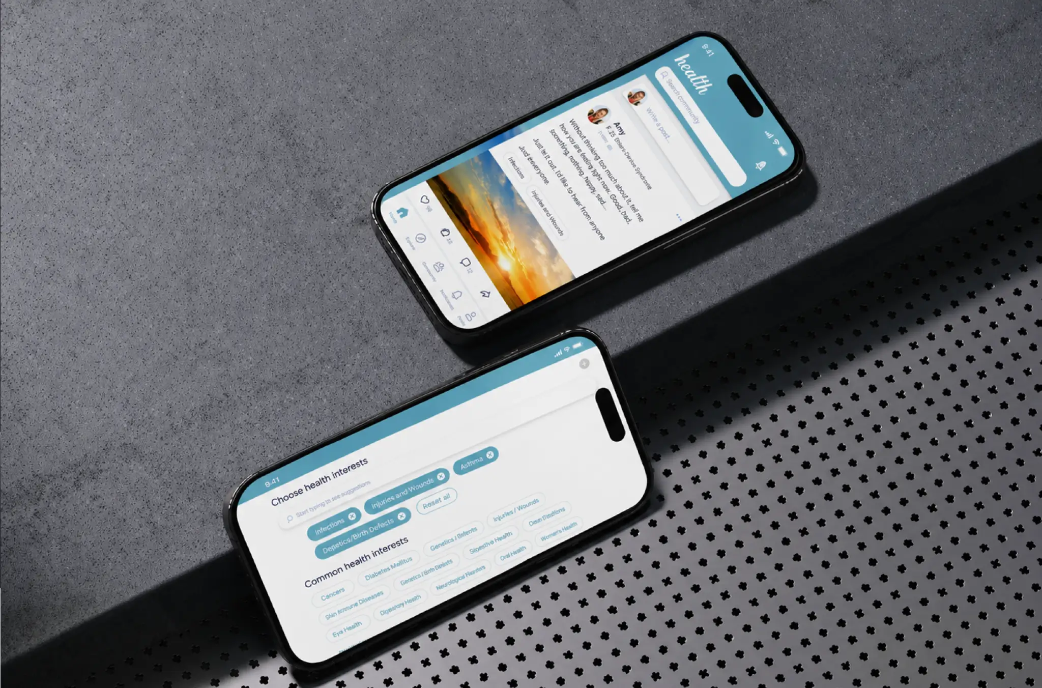
The feed is deliberately quiet. One card per post. Group chat reuses the same card rhythm, so moving between the feed and a live session never feels like switching apps.
Results
Before
- ✕People with a new diagnosis searched general networks and posted health concerns to an audience of coworkers and relatives.
- ✕Condition-specific forums ran on desktop-era layouts, with thin moderation and no mobile app at all.
- ✕Screen-reader users were locked out of most social features across the category.
- ✕Finding someone with the same disease meant joining several groups and hoping one of them was alive.
- ✕No admin tooling for reports, member data, or content management.
After
- ✔4 products live: iOS app, Android app, web app, and a web admin panel.
- ✔3 user roles running on one permission model across mobile and web.
- ✔15 core features in the first release, from SMS verification to public group chats.
- ✔50 WCAG 2.1 AA success criteria audited and cleared before store submission.
- ✔One profile model driving search, matching, feed, messaging, and notifications.
- ✔Community management tools that let moderators track reports and content in one place.
Impact of the Health Community App After Launch
-Verified Reviews
Our Reputation on Top Platforms
LITSLINK holds a 4.8 rating on Clutch and appears among the top software development companies on GoodFirms and similar review platforms. See more of our healthcare software development work.
Have a Health Application Project in Mind?
Planning a health community app, or running one that has outgrown its first version? Tell us who the community is for, what it has to keep private, and which platforms it needs to reach. We come back within 48 hours with a scope and a number.
Thank you for your message. It has been sent.