





How We Built Water Management Software for Smart Home Energy Detection
- 93% F1 on water-use event detection, held-out homes
- <3 sec from sensor reading to labeled event
- ~11% lower water-heating bills in pilot homes
- 1,900+ homes streaming live sensor data
Homeowners see one number on a utility bill. Water utilities see one meter reading a month. Nobody sees which appliance is running right now. We built water management software for a US smart home company that reads live sensor data and tells, within seconds, whether a home is drawing water, heating it, or leaking it.
Project Details
The client sells a home monitoring kit: door and window sensors, cameras, and a flow-and-temperature module that sits on the main water line and the water heater. Their app showed which rooms were armed, but the water data went straight into storage, and nobody read it. They asked us to turn that stream into something a homeowner could act on, and something their two regional water utility partners could plan around.


Business Challenge: Modernizing Home Water and Utility Monitoring
Before the project, the client stored about 70 million sensor readings a day and used almost none of them. A nightly batch job summed total flow per home and pushed one figure to the app the next morning. Heater cycles were invisible, since the temperature probe logged data but nothing interpreted it. Support tickets told the story: “my bill doubled, and the app says nothing” came up around 90 times a month.
The two regional water utilities that bought aggregated data from the client had a related problem. They planned demand from monthly meter reads and a spreadsheet model nobody had touched since 2019. Aging infrastructure in their service areas needed maintenance scheduled around real usage patterns if service reliability was going to hold, and the only real-time data in their utility operations came from the pumping stations.

No Per-Device Usage Attribution
Total flow per day said nothing about which fixture ran. A 40-gallon shower and a 40-gallon slow leak looked identical in the app, so neither the homeowner nor the utility could tell waste from normal use.

24-Hour Data Lag
Events surfaced the next morning. A burst pipe at 2 a.m. showed up as a big number at breakfast, after the water damage. Real-time monitoring was the feature customers asked about most, in support chats and app reviews.

Manual Demand Modeling for Utilities
Utility analysts spent roughly 30 hours a month building demand models by hand from meter reads. Peak-hour planning ran on estimates, and the operational costs of those studies came to about $15K a month per utility.
Technologies Behind the Water Management Platform


Our Water Management Software Solution
One question drove the design: what can a model say about a home three seconds after a valve opens? Not the total. The event. We treated every home as a stream of time series data (flow rate, inlet temperature, heater outlet temperature, and heater power draw) and built a classifier that labels each window of that stream as idle, water draw, heater cycle, both, or anomaly.
Training data came from the client’s own homes. Around 1,900 households opted into the pilot, and 210 of them labeled their usage for six weeks through a two-tap prompt in the app (“Was that a shower?”). That gave us about 38,000 labeled events, enough to train a machine learning ensemble in scikit-learn on hand-built features: flow slope, draw duration, temperature drop at the inlet, and time of day. A plain gradient-boosted model beat the deep learning variants we tested on accuracy and inference cost, so it shipped.
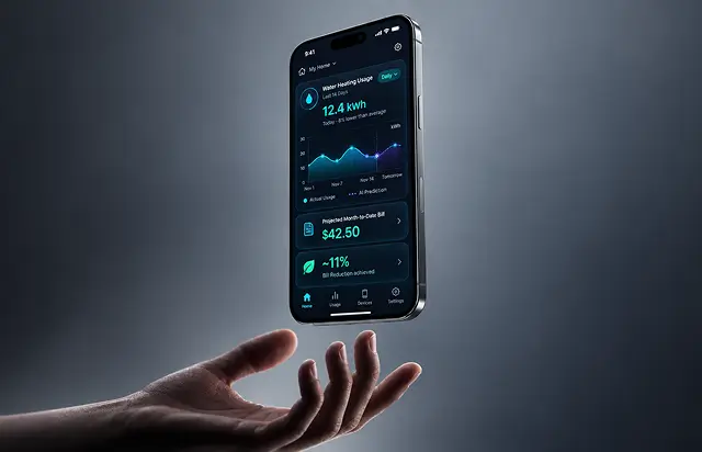
The pipeline runs on Apache Beam over Google Cloud Dataflow. Readings arrive from the sensor gateway, get windowed into 10-second slices, scored, and written to PostgreSQL with the label attached. The model itself is served through an API on AWS, since the client’s mobile backend already lived there. A second model, the prediction model for energy consumption, reads 14 days of labeled history and forecasts the next day’s water-heating load per home with about 8% error.
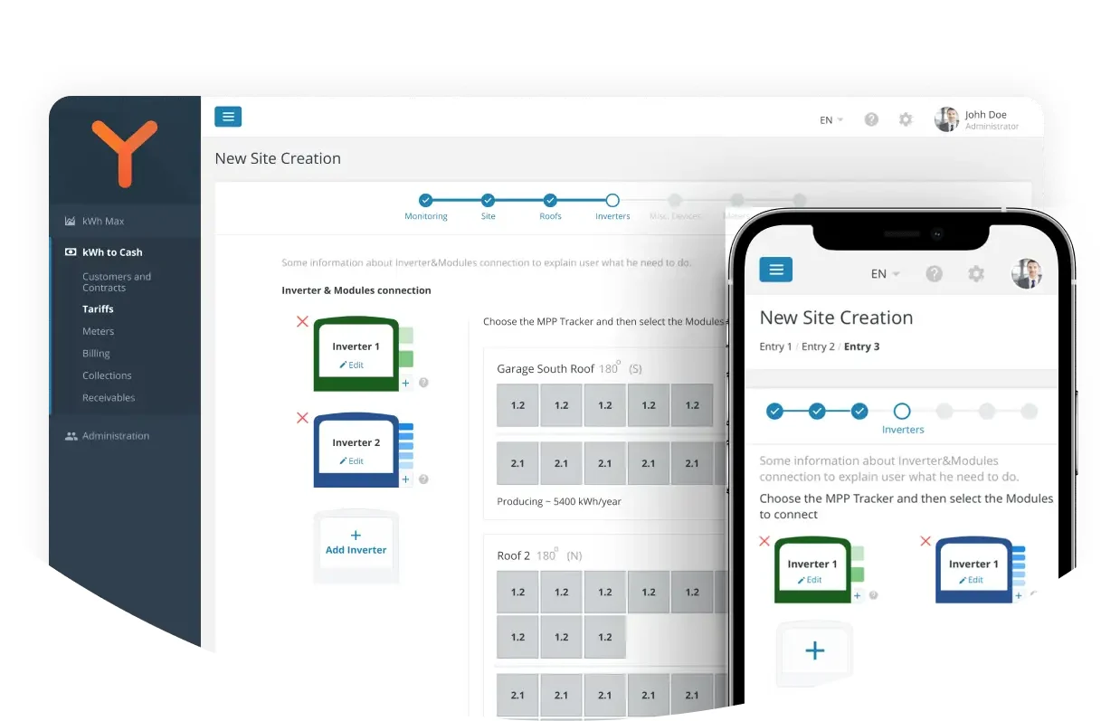
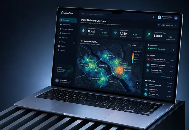
Nothing here is a template. The utility management software the analysts use is a React dashboard that replaced their spreadsheet, and it shows a different view of the same data: hourly demand curves by neighborhood, with no household identified. The mobile app the homeowners use is the one in the screenshots. The key features below are the ones both groups open every day.
Real-Time Water and Heater Detection
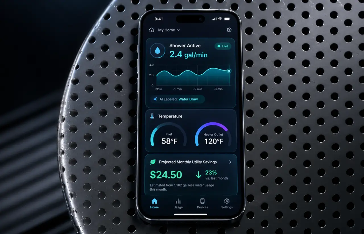
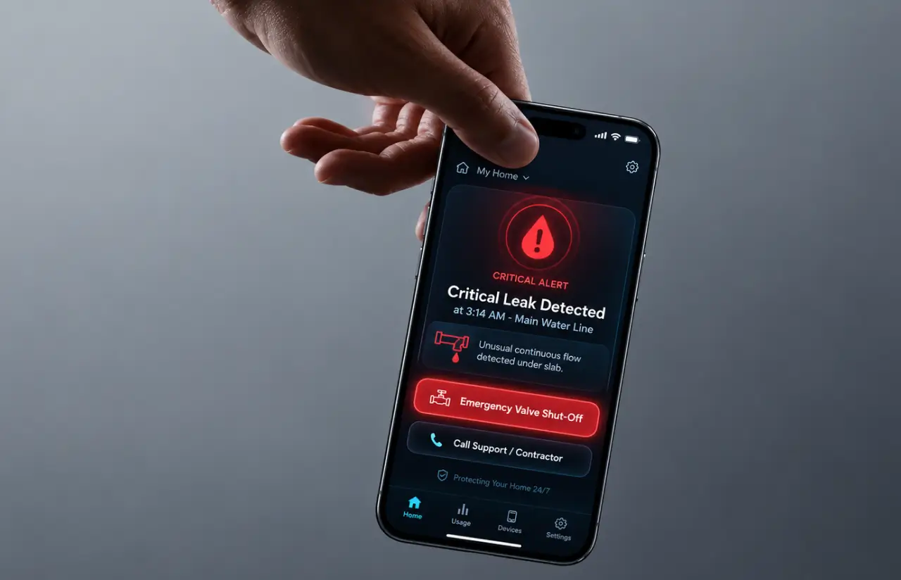
The classifier labels each 10-second window as water draw, heater cycle, both, idle, or anomaly. Labels reach the app in under 3 seconds, so a running tap shows up while it runs, and the daily total updates with it.
Leak and Anomaly Alerts
A draw that runs longer than the home's learned pattern, or flow at 3 a.m. with no heater cycle, triggers a push alert. Twelve confirmed leaks were caught in the first quarter, one of them under a slab, and the emergency response was a phone call instead of a claim.
Prediction Model for Energy Consumption
Fourteen days of labeled history feed a forecast of tomorrow's water-heating load. Homeowners see a projected month-to-date figure in the app, and each utility sees neighborhood demand a day ahead of the pumping schedule.
Utility Demand Dashboard
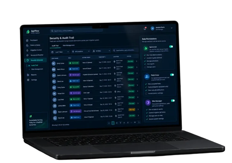
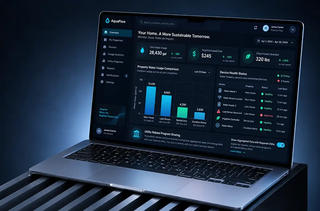
This is the water utility software side of the platform: aggregated hourly curves by service area, with no household data exposed. Analysts at the two partner utilities export peak-hour reports through automated reporting instead of building them by hand from meter reads.
Mobile Home Monitoring App
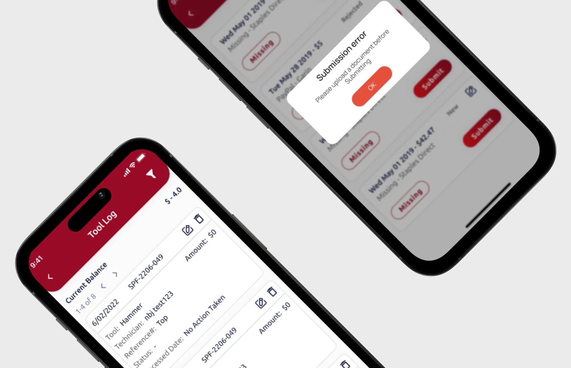
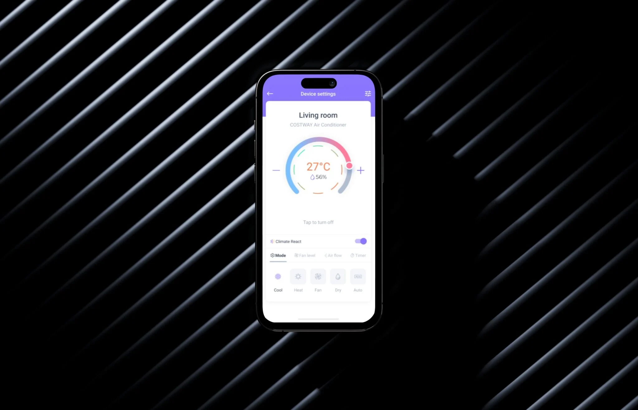
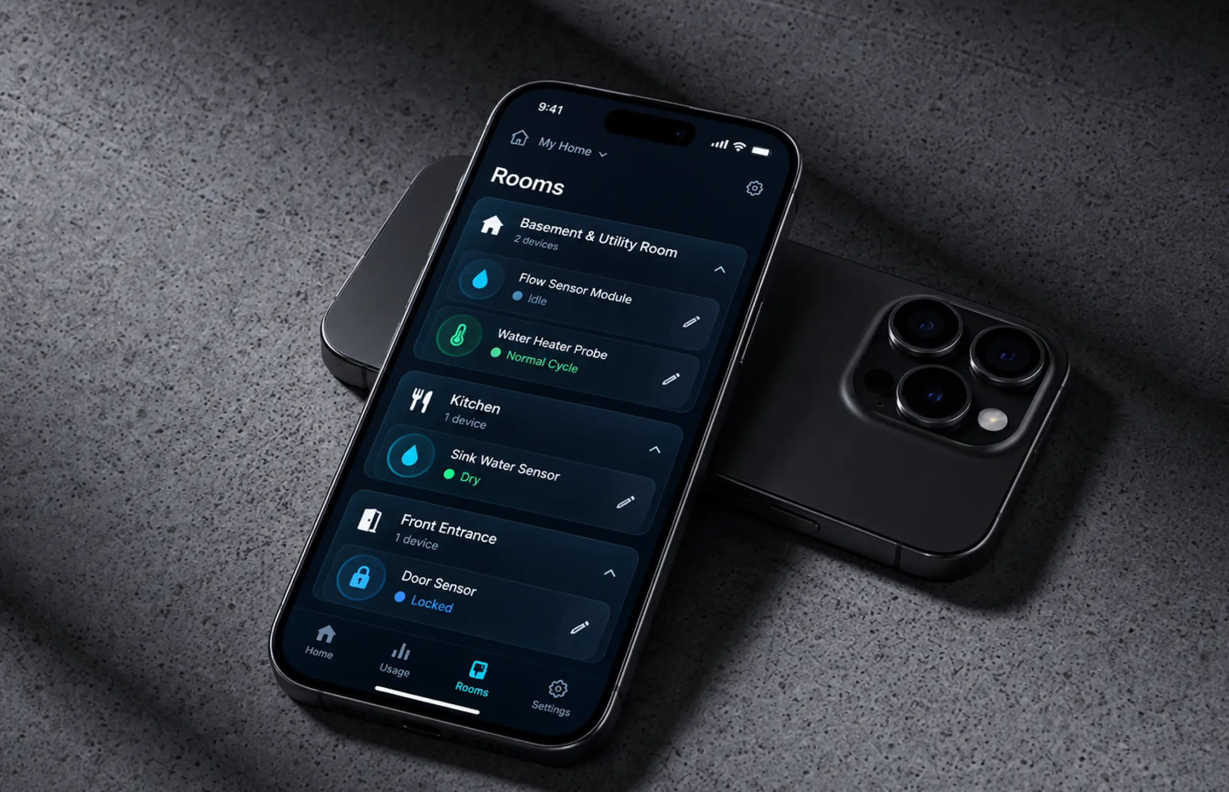
iOS and Android mobile app with a Sensors tab and a Rooms tab. Each sensor tile shows live status, and the water module sits next to the door and window sensors in the same grid, so water assets read like any other part of the home.
Role-Based Access and Audit Controls
Homeowners see their own home. Utility analysts see aggregates only. Every export is logged for compliance reviews, and raw readings are kept for 24 months, then dropped.
Agile Development Methodology
Project Journey
The 18-month engagement ran in three-week sprints, and the first two went to data work: aligning timestamps across three sensor firmware versions and throwing out about 9% of readings that arrived out of order. Discovery settled the event taxonomy (draw, heater, both, idle, anomaly) and the cloud deployment decision to keep raw readings on Google Cloud while serving the model from AWS. Nine people worked the project at its peak, and two utility analysts joined sprint reviews from sprint six onward.
How the Water Management Platform Works
- Flow rate, inlet temperature, heater outlet temperature, and heater power arrive from the home gateway every 2 seconds.
- Apache Beam on Dataflow slices each home's stream into 10-second windows and computes slope, duration, and temperature features.
- The scikit-learn model tags the window as idle, water draw, heater cycle, both, or anomaly, with a confidence score attached.
- Consecutive windows with the same label merge into one event with a start, an end, and estimated gallons or kWh.
- The mobile app shows the running event and the day's total. Anomalies push an alert within 3 seconds of the reading.
- Hourly curves roll up by neighborhood, and the forecast model projects tomorrow's load for the utility dashboard.
Scrum Process Flow
AI development for sensor data cannot be planned on a whiteboard, because the first real homes always break the model. The three-week cadence meant the client watched live labels 24 times before launch, and four of those reviews changed the feature set, including the decision to add heater power draw as an input after sprint five. Two utility analysts joining reviews from sprint six kept the dashboard tied to what they actually plan with.
How We Delivered the Water Asset Management Software Project
- We define the project goal together, agree on priority features, and set a realistic delivery date and budget.
- We build a ranked list of everything the product needs, starting with what matters most to the business.
- Work is broken into short cycles. At the start of each, we select the next set of features to deliver.
- The team builds, tests, and integrates features throughout the sprint.
- At the end of every sprint, you see working software and give feedback that shapes the next cycle.
- Each sprint produces a shippable piece of the product. We review what worked, adjust, and move forward.
UI/UX Design: Intuitive Interface for Water Monitoring Software
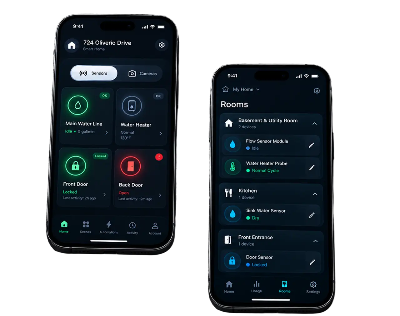
The app already had a home security layout, and we kept it. The Home screen splits into Sensors and Cameras tabs, with the address card at the top and a grid of tiles below. Each tile carries one icon, one label, one color: green when a sensor is locked, or the water line is idle; red when a door is open, or water has been running longer than expected. Homeowners read the grid the way they read a thermostat, in a glance.
We shadowed 14 pilot households before touching the water screens. Nobody wanted a chart. They wanted to know two things: is something running now, and is my bill going to be normal? So the water tile shows a live state and a projected month-to-date figure, and the chart sits one tap deeper. Customer expectations were that simple.
The Rooms tab lists every sensor as a row with a status dot and an edit pencil, and the water assets (module and heater) sit in that list like any other room. Status uses text as well as color after a colorblind tester in week three could not tell the locked and open tiles apart. The utility dashboard follows the same logic on the web: one demand curve per service area, filters on the left, export on the right.
Results
Before
- ✕~70 million readings a day stored, one daily total per home shown to users
- ✕Events visible the next morning, a 24-hour lag on any leak or heater fault
- ✕No distinction between a water draw and a heater cycle, no per-device attribution
- ✕Utility demand models built by hand from monthly meter reads, ~30 analyst hours a month
- ✕~90 support tickets a month about unexplained bills, and no data to answer them
After
- ✔93% F1 on water-use events and 91% on heater cycles, on a holdout of 210 labeled homes
- ✔<3 seconds from sensor reading to labeled event in the app, with drift alarms on the model
- ✔12 confirmed leaks caught in the first quarter, and heater faults flagged in 7 homes before failure
- ✔~11% lower water-heating bills in pilot homes, and ~$180K a year saved by the two partner utilities on manual demand studies
- ✔One platform for homeowners and utility analysts, with billing tickets down to ~25 a month
Impact of the Water Management Platform After Deployment
Verified Reviews
Our Reputation on Top Platforms
LITSLINK holds a 4.8 rating on Clutch and GoodFirms, with Top Developer and Top Company badges on both. Clients writing about our AI and software development work most often mention technical depth in machine learning, steady communication through long engagements, and a willingness to push back on a requirement when the data says otherwise.
Have an Energy Management Project in Mind?
Need water management software that reads live sensor data, utility monitoring software for a fleet of meters, or a home energy management software layer for a device you already sell? Tell us what your sensors record and how often, and a LITSLINK specialist gets back to you within 48 hours.
Thank you for your message. It has been sent.