




Dating Mobile App Development with an Intelligent Matching Algorithm
- 78% match acceptance on profiles scored above 60% similarity, against 34% below it
- ~200 ms median message delivery over WebSockets, down from 900 ms
- 84% profile completion after social sign-up, up from 38% on the prototype
- 5 months from kickoff to the first App Store release
This dating app development solution turns user preferences into intelligent match recommendations through a rule-based algorithm that computes similarity percentages and displays proximity. User data stays encrypted while the whole experience runs inside one native iOS mobile app.
Project Details
A US mobile startup came to us with a validated dating concept, a 300-person test group, and no working product. Their testers repeated two complaints about every dating app on their phones: browsing felt random, and distance was guesswork. They wanted a dating app that could explain every recommendation it made.


Business Challenge: Creating a Competitive Dating App in a Saturated Market
Nothing about the concept was unusual. Swipe, match, chat. What the client needed was a reason for a first-time user to stay past the fourth card, and in a competitive market that reason had to show up within seconds of opening the dating app. Every competing product ran the same three screens, so the difference had to live in the ranking.
The startup had money for one native build rather than for a web client and a mobile app at once, so the web app moved to the roadmap in week two. That cut the list from 14 candidate features to six. Dating app development on this budget is mostly a question of what you refuse to build, and three problems shaped every decision after that.

Intelligent Matching Algorithm Development
Similarity had to be computed across roughly 40 profile attributes and returned as one number a user could trust. Ranking that felt arbitrary would have cost the product its only real differentiator.

Consistent User Experience on Mobile
Stock UIKit controls could not carry the card deck, the swipe physics, or the match animation. Every custom control had to behave the same on a four-inch iPhone SE and on the largest Pro Max screen, at 60 fps.

Backend Infrastructure Under Real Load
Location queries, message sockets, and push delivery all hit the same Node.js service, so backend development could not lag behind the app. At launch, it had to hold a few thousand concurrent sessions.
Technologies Behind the Custom Dating App


Our Smart Dating App Development Solution
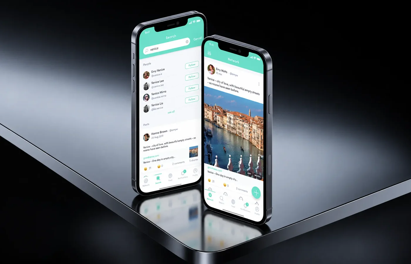
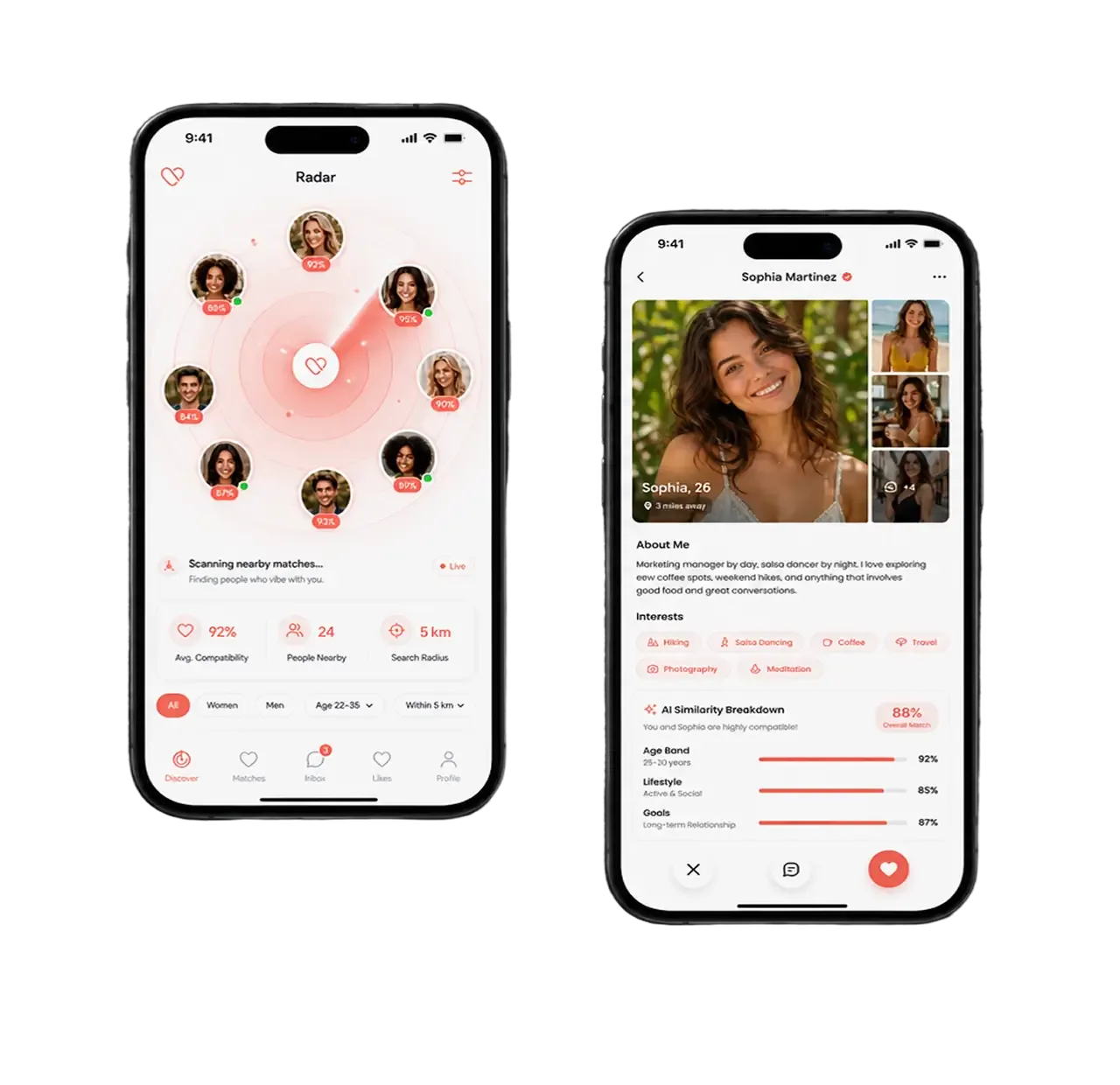
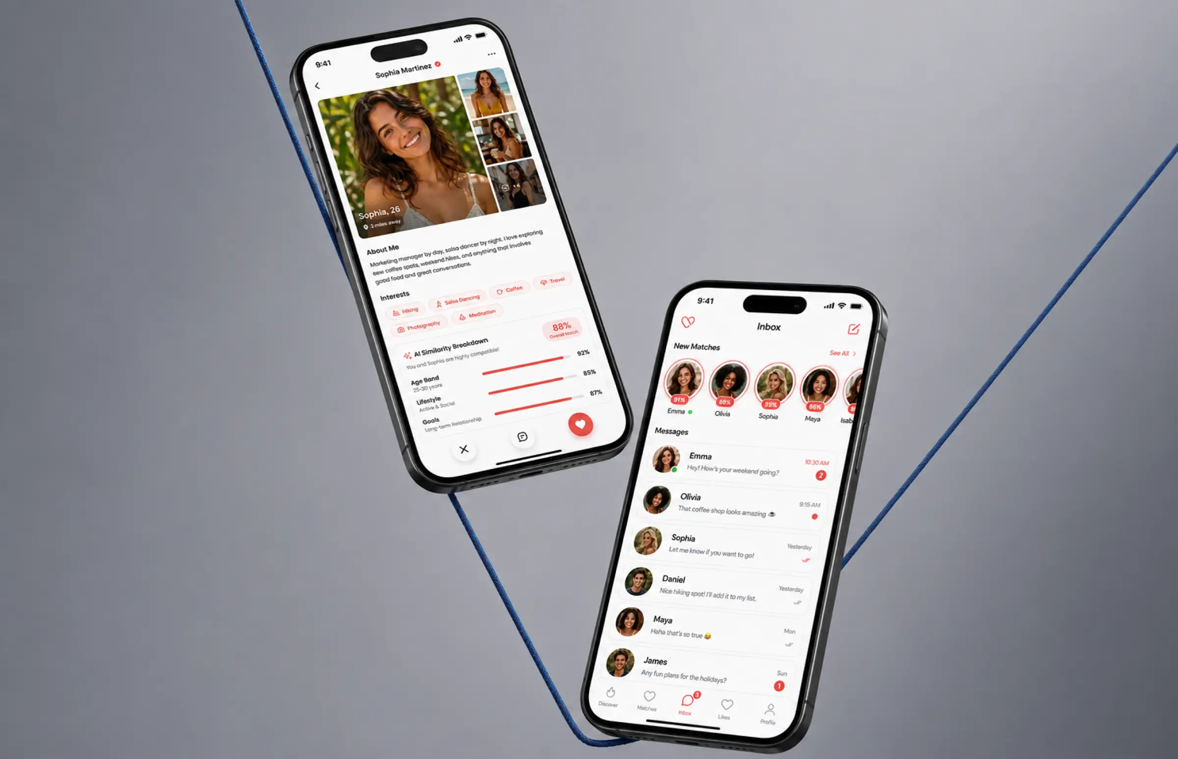
One idea shaped the dating app. A person deserves to know why someone was recommended to them. The matching logic was designed around different relationship goals, unlike many dating applications that leave that intent opaque. The matching engine reads the preference set from sign-up, compares it against user profiles of people running the same app nearby, and returns a similarity percentage between 0 and 100. Proximity sits right next to it, and both numbers appear on the card before anyone swipes. The algorithm matches partners by attribute overlap rather than by who logged in most recently.
The scoring rules are readable on purpose. Twelve attributes carry most of the weight, including age band, distance, stated intent, and eight interest tags. Stated intent also helped the product fit different relationship goals and more inclusive profile setups across diverse gender identities. Matching algorithms in most products stay hidden from everyone, including the founder, and this custom dating app keeps its logic in a spreadsheet the client can edit. That mattered when they wanted to retune the weights after the first thousand sign-ups.
Three rules govern the deck: under 35% similarity, outside the radius, or passed within 30 days, and users could filter results by radius and preference inputs to find more relevant matches. Most apps in this category show a photo, a name, and an age, while this dating app shows the math. Our earlier work on social media app development gave the team a sign-up flow, and no web client shipped in version one. The team picked advanced technologies only where a user would feel them, so every hour of dating app development went into the four screens people use. The six features below are what shipped.
AI-Powered Matching System
The engine scores about 40 attributes per profile and returns a similarity percentage on every card. Matching algorithms re-rank the deck each time filters change, so match quality holds as the user base grows and helps people find other users faster. Most of the development effort landed here.
Social Media Integration Platform
A social account creates the profile, so name, age, and photos arrive prefilled. Social sign-up reduced friction at login while leaving room for stronger authentication and identity verification later, which is crucial for user safety in dating apps. Profile completion climbed from 38% to 84%, and people who connect photos manually take three minutes instead of 45 seconds.
Real-Time Chat and Communication
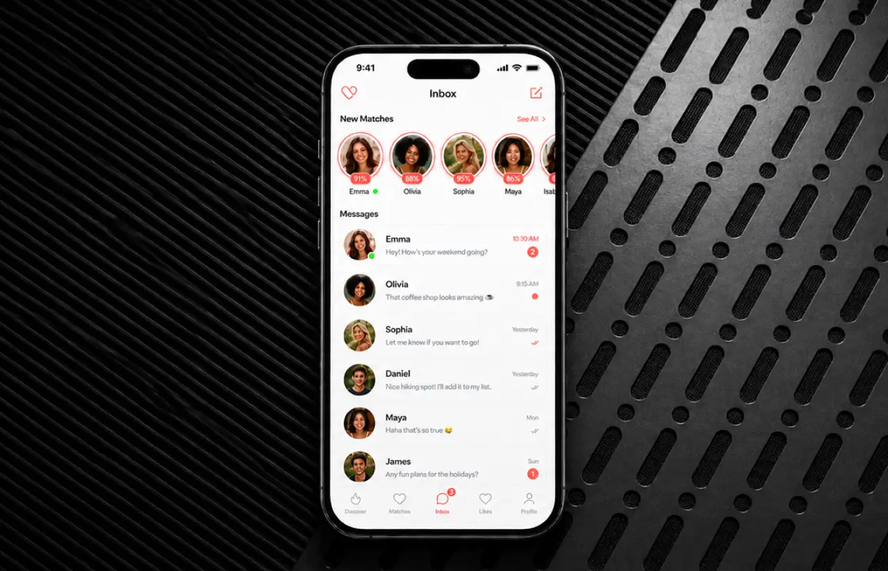
A match opens a WebSocket thread with typing indicators, read states, and photo sharing. Two people connect the moment both taps land, delivery holds near 200 ms, and secure messaging keeps every thread encrypted. Message filtering was planned as part of the trust layer to detect harassment and grooming patterns in abusive content.
Geolocation-Based Discovery
Google Location Services feed the proximity value beside each score. Location filters set a radius from 1 to 100 miles, and location-based discovery refreshes the deck when someone moves half a mile.
Push Notification System
APNs handle new match alerts, unread messages, and nearby high scores, and users pick which they want. Open rate settled near 27%, double what the client budgeted.
Profile and Preferences Module
Photos, bio, discovery radius, and visibility live on one screen of the dating app, and edits reach the matching engine immediately. Report and block sit beside the rest of the safety tools, and photo moderation helps prevent fake profiles and strengthen trust.
Scrum Methodology
Project Journey
The five-month dating app development ran in two-week sprints, starting with three sprints on the matching engine because the other five features depended on its output. Design and native development ran in parallel from sprint four; backend development and QA joined in sprint five, and the last two sprints covered App Store submission and load testing. Six people carried the dating mobile app development from kickoff to launch, and as with most clients, a demo build was in their hands from week six.
How the Dating Platform Works
- A user connects a social account, which creates the profile with name, age, and photos already filled in.
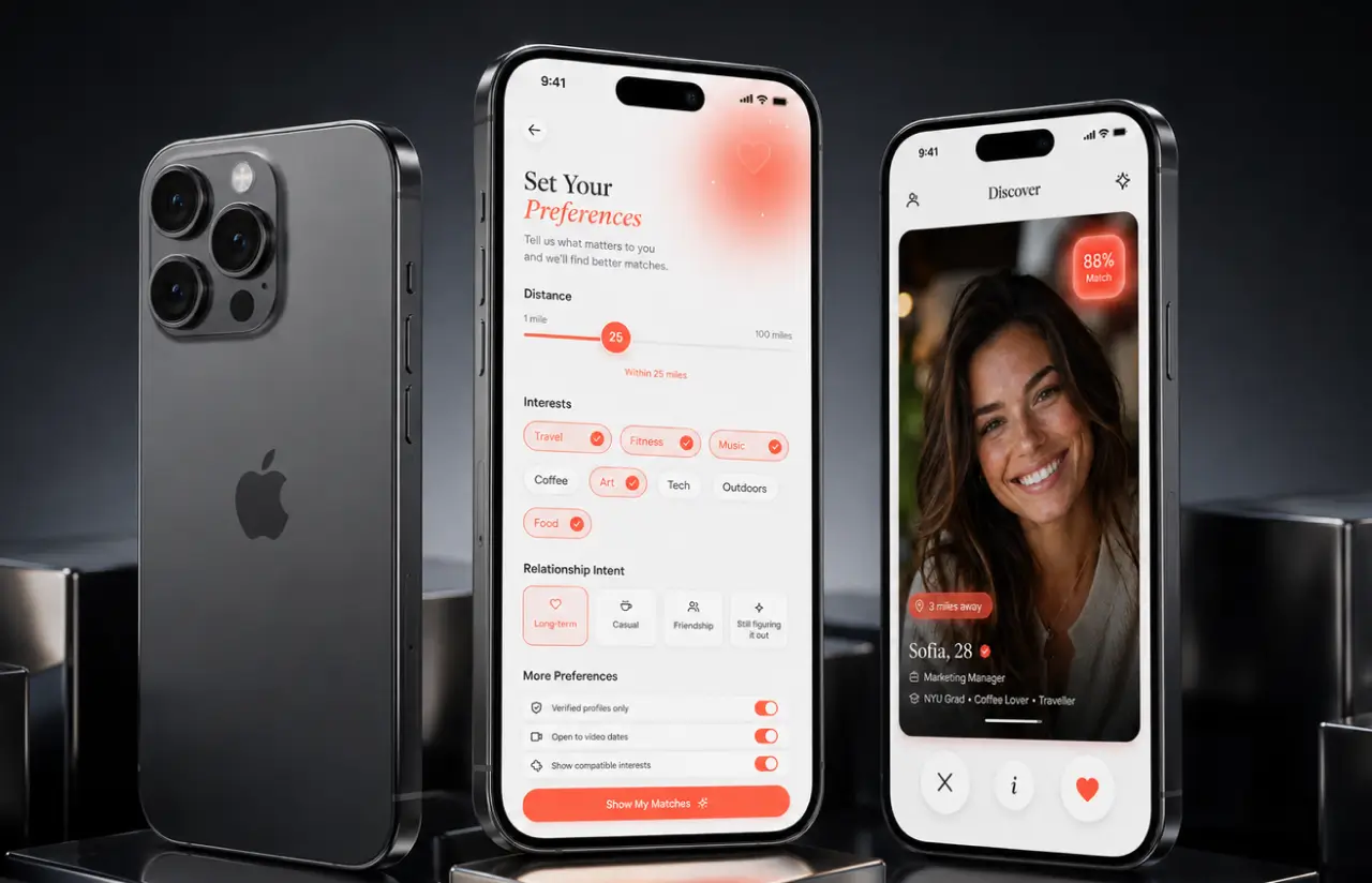
- Age range, distance, and interest tags create the preference set. The radius slider runs from 1 to 100 miles.
- The engine compares that set against nearby profiles and creates a percentage. Under 35% never reaches the deck.
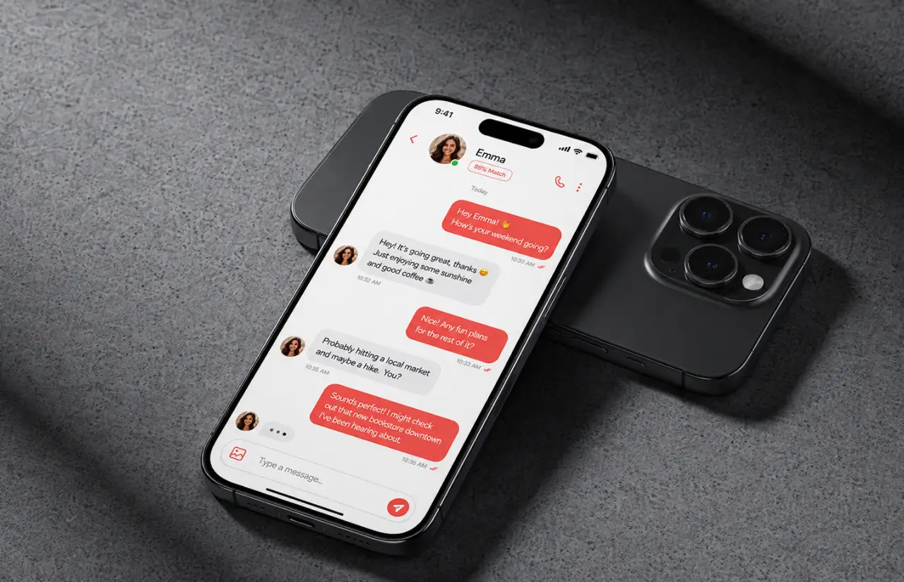
- Cards arrive ordered by score and proximity, each carrying the similarity percentage and the distance.
- When two people like each other, real time chat opens with one tap. Messages travel over WebSockets in roughly 200 ms.
- New matches, unread messages, and nearby high scores trigger a push, and about a quarter open within ten minutes.
Scrum Process Flow
Scrum here meant a fixed rhythm rather than a calendar full of ceremonies. Planning on Monday, a standup daily, review and retro on the second Friday, and anything asked for mid-sprint went into the next one. The same cadence runs across our mobile app development engagements. Clients get the board, the burndown, and the demo build from sprint one, and most clients stop reading the weekly report once the demo answers the same questions.
How We Delivered the Dating App Project
- We define the project goal together, agree on priority features, and set a realistic delivery date and budget. Early wireframe work helps visualize the product before feature delivery starts.
- We build a ranked list of everything the product will include, starting with the features the business and users need most.
- Work is broken into 2-week cycles. At the start of each, we select the next set of features to deliver.
- The team builds, tests, and integrate each feature into the working product throughout the sprint, and development stays visible to you.
- At the end of every sprint, you see working software and give feedback that shapes the next cycle.
- Each sprint produces a shippable piece of the product. We review what worked, adjust, and move forward.
UI/UX Design: Intuitive Interface for Modern Dating
The design brief asked for warmth without the usual dating app clichés. Our product design team created one coral tone across the whole app, white cards, and a single script logotype. The restraint was deliberate: better usability came from a visual system that stayed simple instead of decorative.
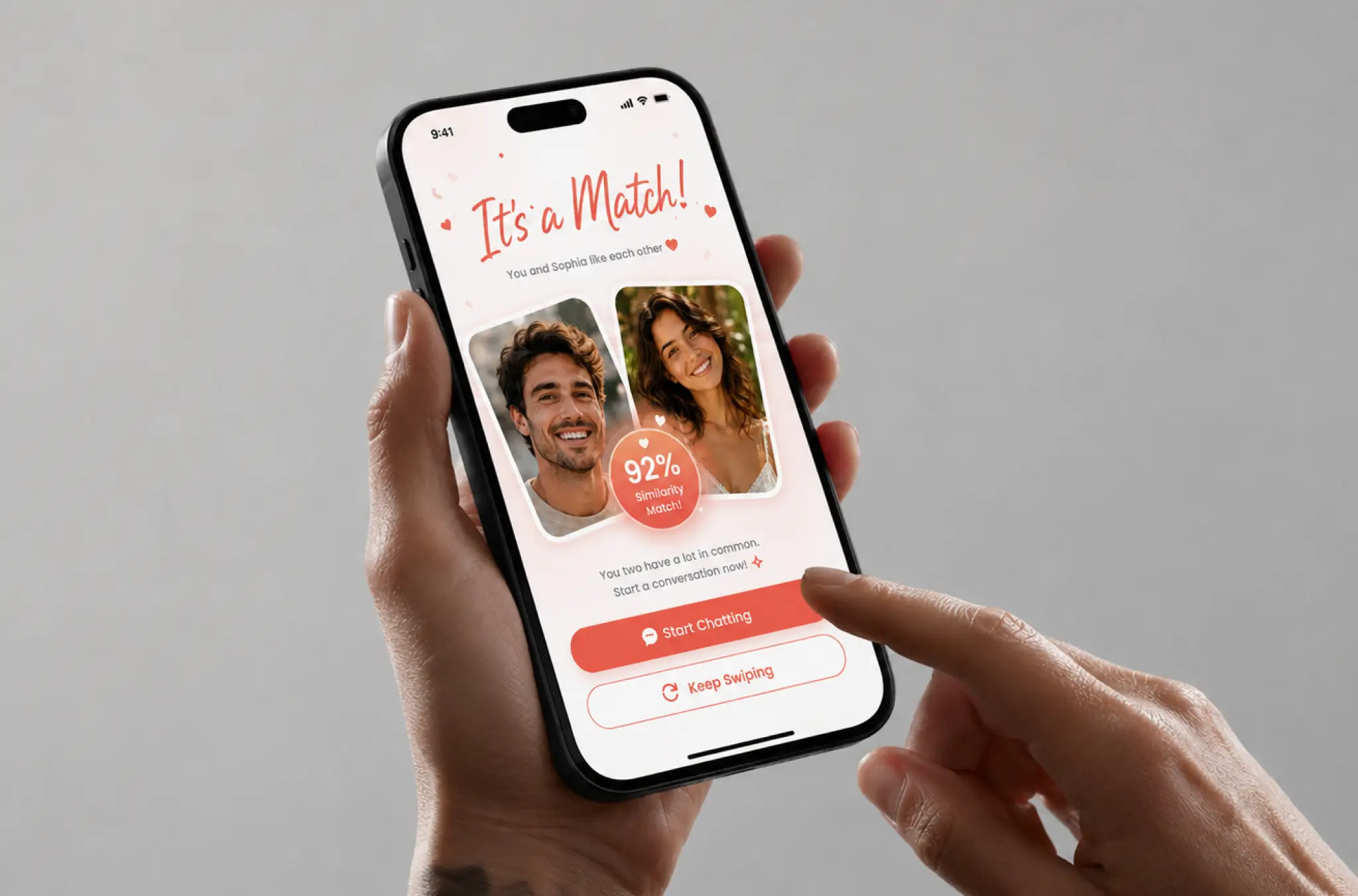
Three screens do the heavy lifting. Discovery shows a photo card with name and age and three controls underneath, pass, profile, and like, with clearly defined actions placed for one-handed reach. The radar screen fills the wait while the dating app looks for compatible users nearby. The match screen puts both photos side by side with two paths built for conversion: keep swiping or start chatting.
Designers created 34 screens and the dating mobile app shipped with 11, and the same coral palette carried over to the web landing page so the App Store screenshots and the app read as one product.
Results
Before
- ✕Concept deck, a 300-person test group, no working iOS build
- ✕Profiles shown in no particular order, with no way to tell how far away anyone was
- ✕Profile completion stuck near 38% on the prototype
- ✕Conversations moved off to other messaging apps
- ✕No push, no reason for a lapsed user to come back
After
- ✔Custom dating app live in the App Store after 11 sprints and five months
- ✔Similarity percentage and distance on every card, radius adjustable from 1 to 100 miles
- ✔84% profile completion after social sign-up, up from 38%
- ✔Real time chat inside the dating app, median delivery around 200 ms
- ✔27% push open rate, roughly double what the client had budgeted, with reporting and blocking shipped from day one
Impact After Launch
Verified Reviews
Reputation of Dating App Development Company LITSLINK on Top Platforms
Most clients compare three or four shops before they pick a dating app development company. LITSLINK holds a 4.8 rating on top platforms. Clients writing about our dating mobile app development work mention technical depth, steady communication, and a willingness to push back when the data says otherwise.
Have a Dating App Development Project in Mind?
Every dating app development project here starts with one call: who your users are, and what a good match means to them. Send us the concept, the wireframes, or the build you already have, and our dating app developers come back within 48 hours.
Thank you for your message. It has been sent.