





Mobile App UI UX Design Services: Redesigning a Social App for App Store Launch
- ~40% saved vs. a ground-up rebuild
- 91% task completion in final usability tests
- 48 screens redesigned in 10 weeks
- 1st submission approved by both stores
The client came to us with a working codebase and a failed design engagement behind them. We provided mobile app UI UX design services and prepared the mobile app for App Store and Google Play review.
Project Details
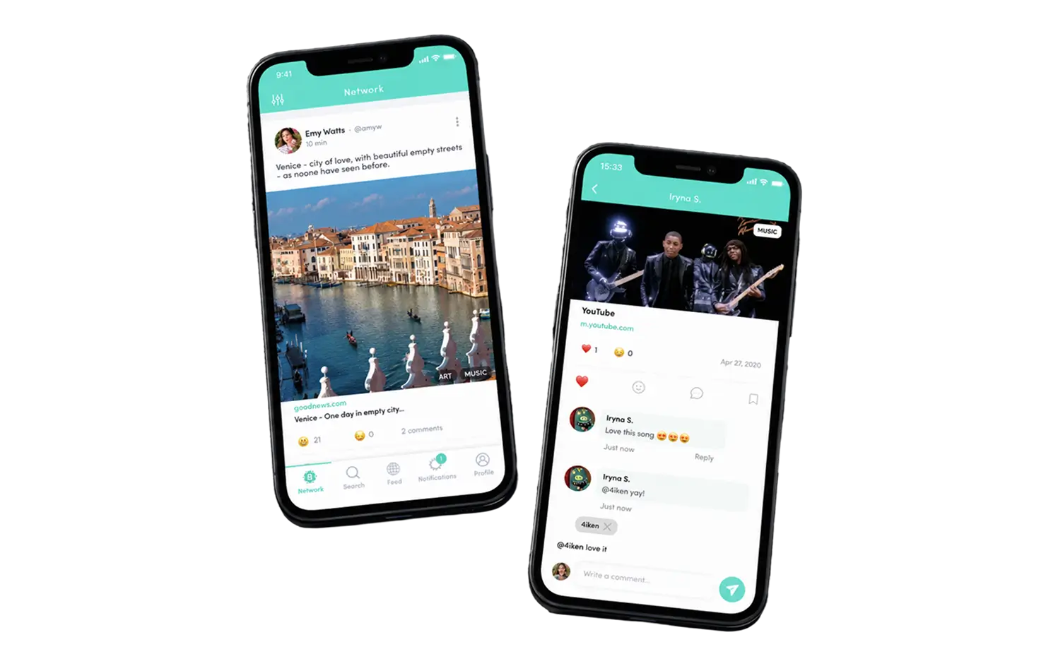
The client is a US-based startup building a mobile application for uplifting content: users post links to good news, art, music, and charity stories, and every post is public and votable. A previous mobile app design agency had delivered mockups that never made it into the product. Our job was design only: rethink the mobile app UI UX, hand the client’s own team implementation-ready specs for the mobile application, and get two store listings and a landing page ready for launch day.


Business Challenge: Creating UI UX Design That Users Actually Love
By the time the founders reached LITSLINK, they had spent roughly five months and a second budget on a mobile app project that could not ship. The first agency produced 30-odd static screens with no user flows, no component library, and no read on user behavior. Nobody could answer the question that mattered: why do new users open the mobile app once and never come back? The codebase itself was fine. The app’s design was the bottleneck, and every planned batch of new features was stuck behind it.

Onboarding lost half the users
Internal test builds showed about 52% of first-time users dropping off before their first post. The old mobile screens explained nothing about voting, anonymity, or what belonged in the feed, so the user journey ended before it started. User needs and user expectations were never mapped, so there was nothing to design against.

Feed, search, and post looked unrelated
Three screens, three visual languages. Buttons changed shape between tabs, the color scheme drifted from teal to blue, and the post composer hid the link field. The app's design had no UI design system to fall back on. User feedback from those sessions became our first backlog.

No path to store approval
Neither store listing existed. Screenshots, icons, permission copy, and privacy disclosures were all missing, and the mockups ignored platform guidelines for iOS users and Android alike. A rejection at review would have cost another month.
Technologies Behind the Social Media App Redesign


Our Mobile App UI UX Design Solution
We started with user research instead of pixels. Two UX specialists ran user interviews with 14 target users, mapped six user personas, and rebuilt the information architecture from the ground up. The core insight was simple. People were not confused by the app functionality; they were confused by the rules. So the new user journey teaches the rules first: all posts are public, downvotes are anonymous, and content that gets buried stays buried.
From there, the team sketched user flows for 11 core tasks, from “follow from contacts” to “share a post with commenting off.” This is how our UX specialists sketch layouts on every mobile app project: low-fidelity first, then interactive prototypes the founders could tap through on their own phones. Each flow went through usability testing with 8 to 12 participants before we drew a single high-fidelity screen. Three rounds of thorough usability testing in total, with user testing notes feeding the next sprint.
The visual design kept the existing company color scheme, a single teal accent with a yellow smiley mascot, and our UI designers pushed it into a proper UI kit: 48 mobile screens, 120+ components, and a spacing and type system that works on both operating systems with cross-platform consistency. The result is a well-designed user interface that the client’s developers could implement without guessing, plus a landing page that explains the product in one scroll.
This is what mobile application design services look like when the scope is honest. No rebuild, no new stack. Just the mobile app UI design and UX work the product was missing, delivered against the client’s business goals.
Five-screen illustrated onboarding
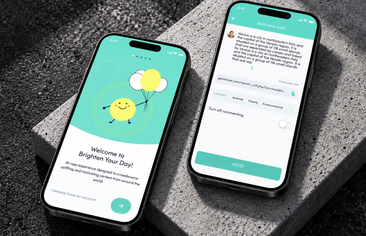
Each screen states one rule of the community, from public posting to anonymous downvoting, with a Lottie animation of the mascot. Completion rate rose from about 48% to 84% in the final test round, and the Skip link stays visible throughout.
One feed, three tabs, one language
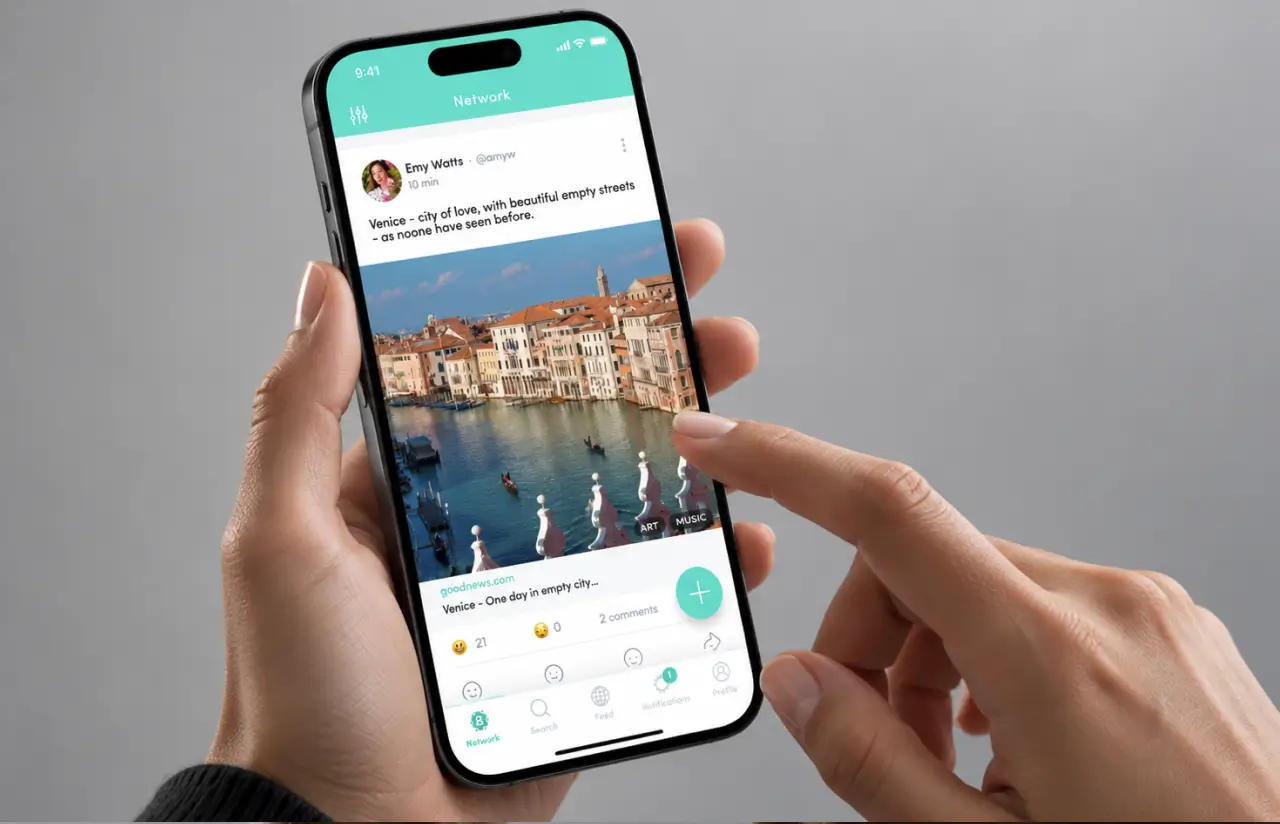
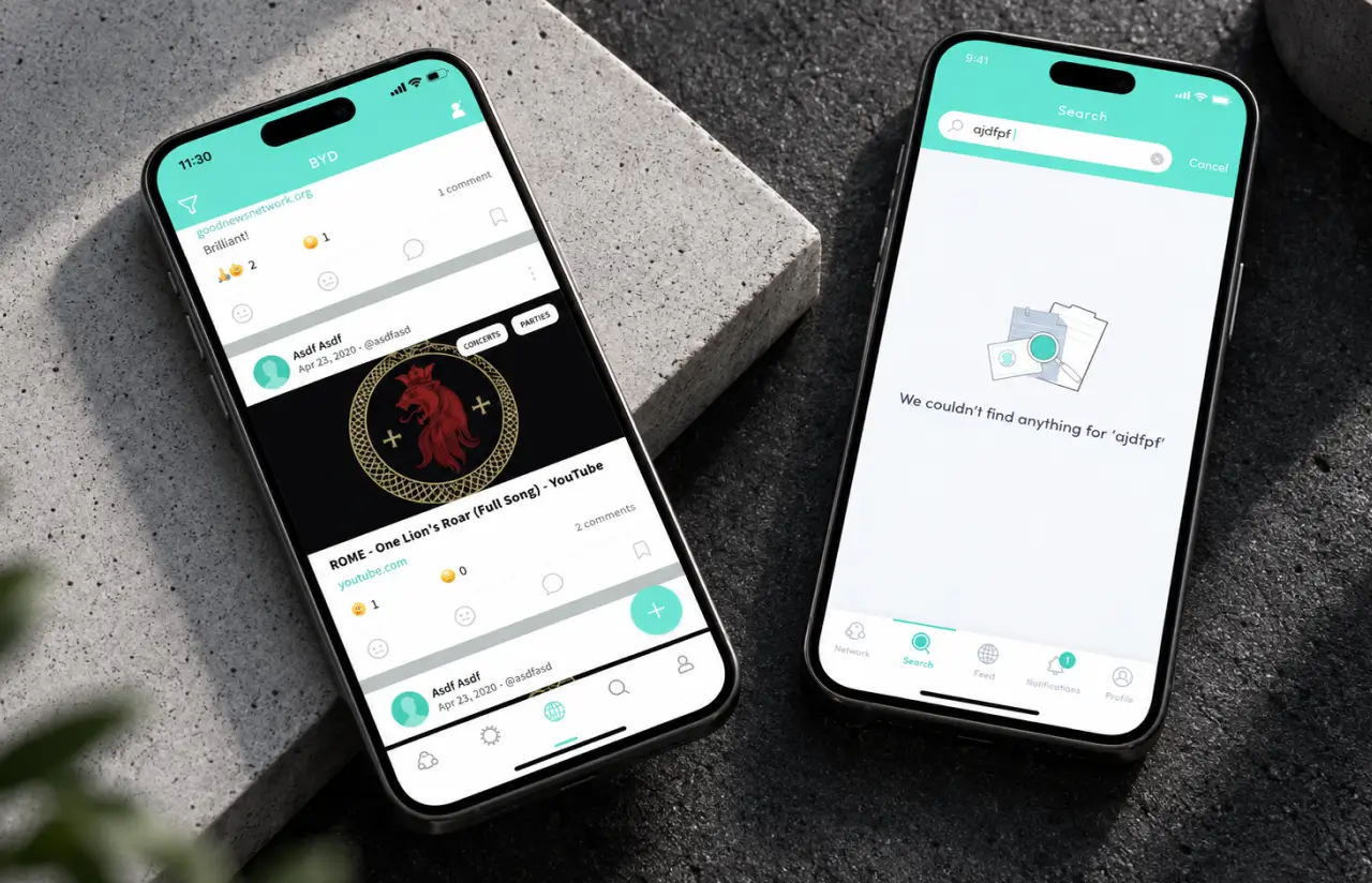
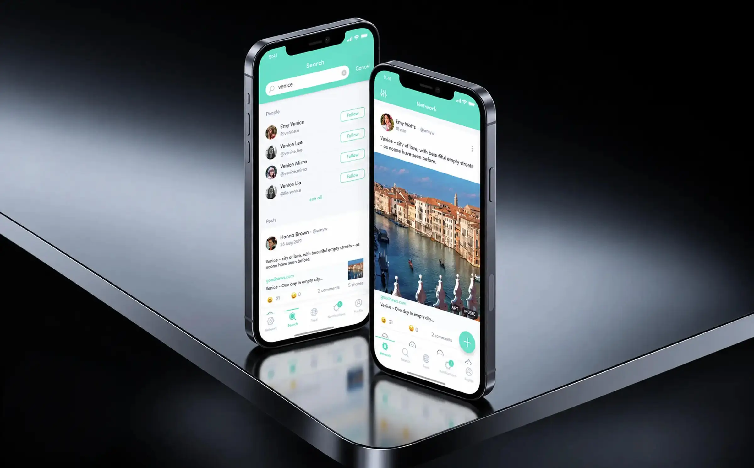
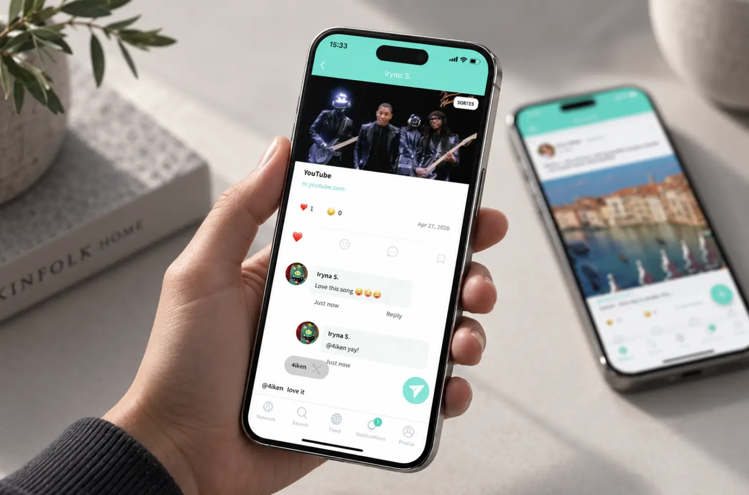
Network, Feed, and Search now share a single card component: author, category chips, link preview, emoji reactions, and comment count in the same positions. Users stopped hunting for the share button, which cut time to first share by roughly 60%.
A post composer built for links
The URL field sits directly under the text area with a paste button, a live character counter (250 max), category chips, and a toggle to turn off commenting. Median time to publish a first post fell from about four minutes to 90 seconds.
Follow suggestions that fill an empty feed
New accounts land on a Suggested for You list with a one-tap Connect from contacts, so the first session already has content. Day-one follow actions per new user roughly tripled in testing.
Store-ready assets and platform compliance
Icons, screenshot sets, permission prompts, privacy and data security copy for both App Store and Google Play, checked against each platform's guidelines. Both listings passed review on the first submission.
Agile Methodology
Project Journey
We ran the project in five two-week sprints, each closing with a clickable prototype review on the founders’ own devices. Sprint one was research and elaborate project analysis only. Sprints two through four covered onboarding, feed, and creation flows in that order, and sprint five was dedicated to store assets, the landing page, and developer handoff.
Social Media App UI UX Design: Creating Intuitive Experiences
Every screen in the app’s design had to answer one question within a few seconds: what do I do here, and why would I want to? We wrote that question on the wall in FigJam and tested every flow against it.
Early prototypes used a thumbs-down icon for downvotes, and 9 of 12 participants hesitated to tap it because it felt public. The final UI uses a neutral sad-face reaction, and the onboarding copy states the anonymity rule outright. Downvote usage in tests went up, which is exactly what a self-cleaning feed needs.
Visual elements follow one rule: the teal header, the white card, and the yellow mascot are the only three things that ever compete for attention. Category chips are quiet. Reaction counts are small. The floating plus button is the single saturated element on the feed, and eye-tracking-style heatmaps from Maze showed it drawing the first tap in 7 of 10 sessions.
For developers, the handoff included the full Figma UI kit with auto-layout components, a spacing scale, redlines for every screen state (empty, loading, error), and a short guide on where iOS and Android should differ, such as the back navigation and the share sheet. The client’s React Native team implemented the redesign in about six weeks with 11 design-related tickets total, down from a backlog of 60+ under the previous mockups.
Results and Impact
Before
- ✕~52% of first-time users dropped off before their first post
- ✕Onboarding completion around 48%, with no explanation of voting rules
- ✕Median time to publish a first post: ~4 minutes
- ✕Three screens, three visual styles, 60+ open design tickets
- ✕No store listings, no landing page, one failed agency engagement
After
- ✔91% task completion across 11 core flows in final usability testing
- ✔Onboarding completion up to 84%, a 36-point gain
- ✔First post in ~90 seconds, roughly 60% faster
- ✔48 screens, one UI kit, implemented by the client's team in ~6 weeks
- ✔Both stores approved on first submission, landing page live before launch
Impact After Launch
Verified Reviews
Our Reputation on Top Platforms
LITSLINK holds a 4.8 rating on top platforms. Clients in the social and community space mention the same things: research before pixels, prototypes they can tap, and a handoff that developers do not argue with. Our product design team and app development engineers have shipped 1,540+ projects since 2014, from consumer mobile apps and web platforms to enterprise level apps and secure mobile banking apps with complex workflows behind a simple user interface.
Need Mobile App UI UX Design Services?
Our UI UX design services cover new products, mobile app redesigns, and matching web experiences. Share your users’ challenges, and we’ll reply within 48 hours with an initial scope and design approach aligned with your business goals.
Thank you for your message. It has been sent.