




Building a Senior Care App for Finding Trusted Caregivers
- 3 platforms, one Flutter codebase
- 4 user roles, one back end
- Vitals logged in under 30 seconds
- 56 px tap targets on every screen
A healthcare startup came to LITSLINK for senior care app development that older adults could actually use: big buttons, high contrast, and a way to find a vetted private carer without a week of phone calls. We built the web and mobile apps that let patients, caregivers, and family members keep every health record in one place.
Project Details
The client is a US healthcare technology startup building an elder care marketplace where families find a fully trained private carer or support worker for a parent or grandparent. The founders wanted more than a directory. They asked for a caregiver platform with web and mobile apps where patients, caregivers, and families manage records together, and where people with poor eyesight can get around the app without help.


Business Challenge: Creating a Comprehensive Senior Care Solution
Before this project, the client’s users were juggling three things at once. Finding a carer meant calling elder care agencies and waiting for callbacks. Health records lived in paper folders, phone notes, and a caregiver’s memory, so healthcare providers saw a fraction of the picture at each appointment. And the relative paying for personal care had no view of what happened between visits and no remote monitoring of any kind.
The founders had also tested a handful of consumer apps for health tracking with their own parents. Every one failed the same way: text too small, buttons too close together, and menus that senior citizens with low vision could not read without a magnifier. That is the bar the senior care app had to clear.

Reliable Emergency Response Path
When a patient reported early signs of trouble, dizziness or a missed dose, there was no shared place to flag it. Caregivers texted whoever picked up. Issues got lost, and families heard about problems days later, sometimes after a hospital visit.

Multi-Generational User Experience
One product had to serve a 78-year-old patient managing chronic conditions and cataracts, a caregiver switching between clients, and an adult child checking in from another state. Most mobile apps in elder care are built for the youngest of those three.

Healthcare Data Integration and Compliance
Vitals, medication records, and doctor visit notes are sensitive health data. The platform had to store medical records securely, give each role only what it needs, and log every change. Nothing off the shelf covered all four roles.
Tech Stack Behind the Senior Care Platform


Our Senior Care App Development Solution
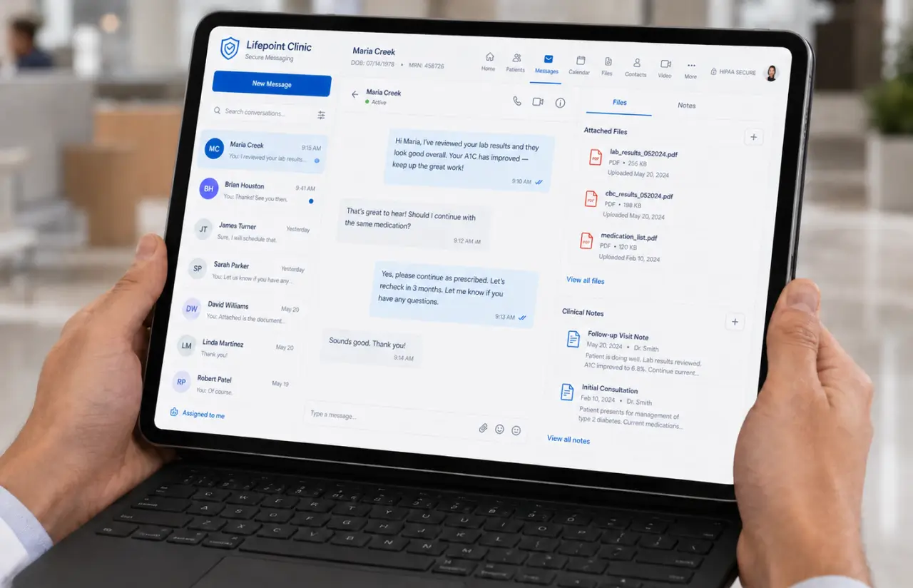
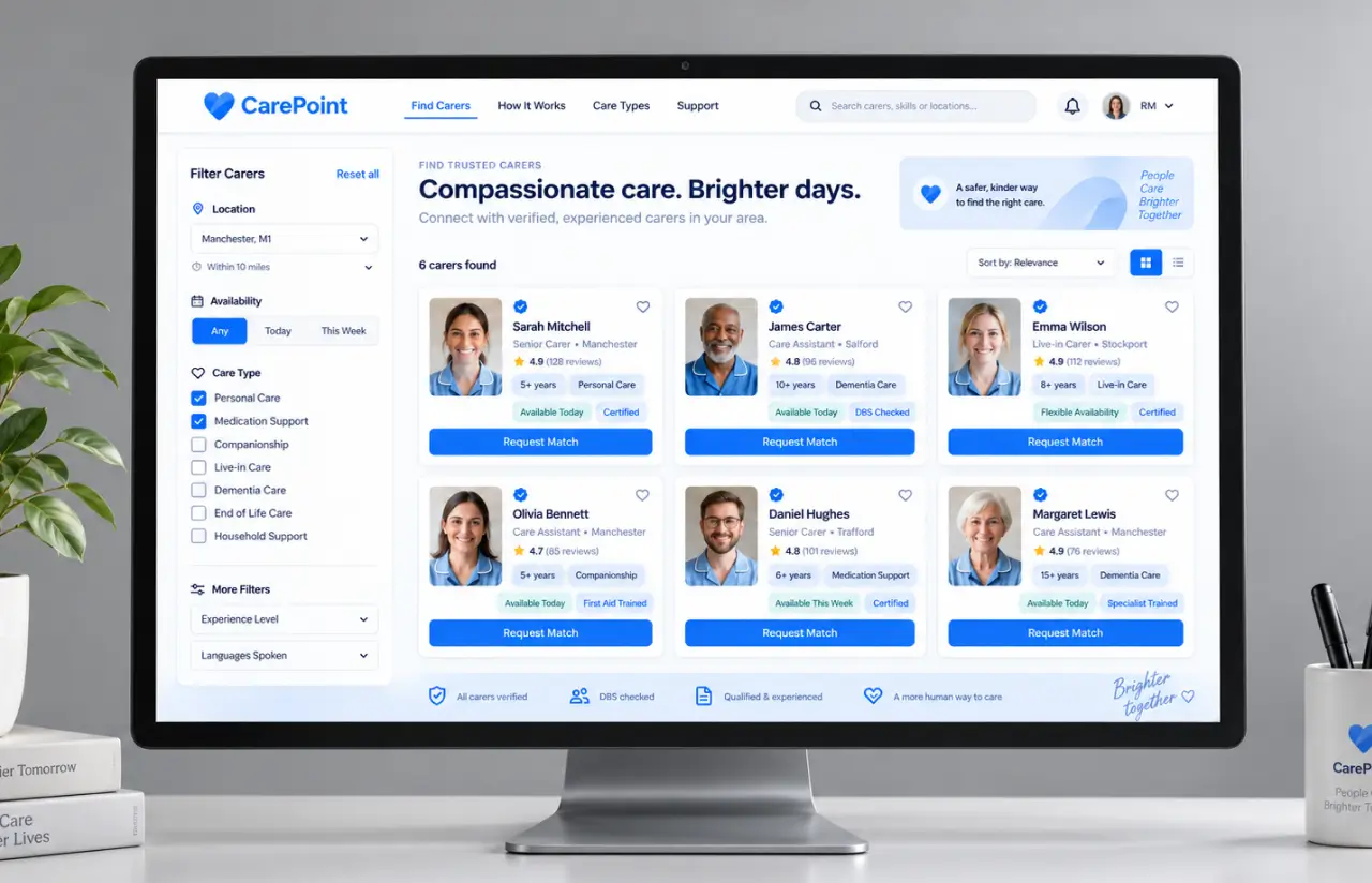
Care app development started with one decision: two connected products rather than one. A web app handles carer search, admin, and detailed record management. A senior care mobile app covers daily use by patients and caregivers. Both run on the same back end, so a vitals record added from a phone in Alameda shows up on a daughter’s laptop in seconds.
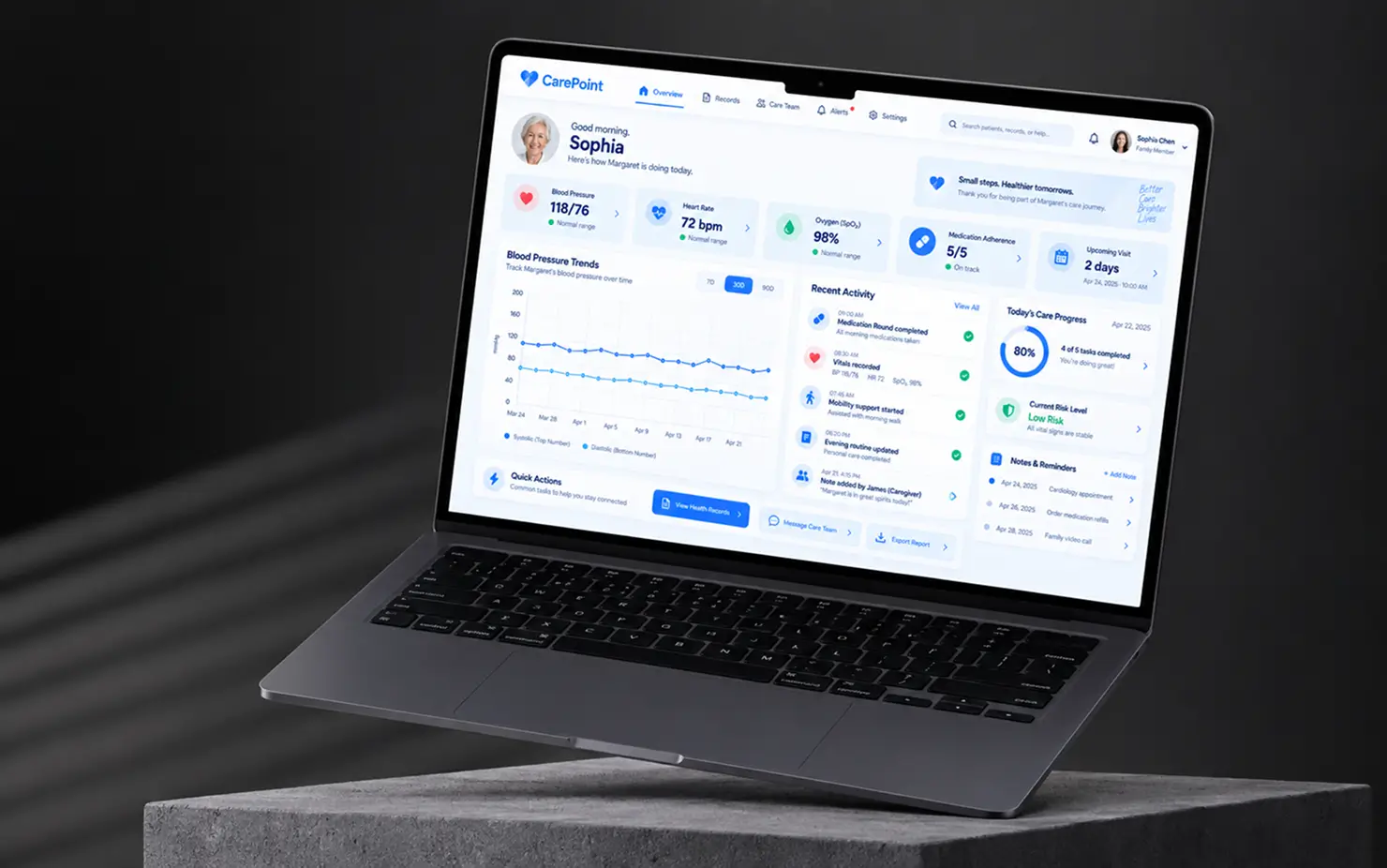
The heart of the caregiver app is the records module. Each entry has a start date, an end date, a summary line (say, “Doctor/Health Visit; Dr. Sellman”) and structured details: a blood pressure reading or other vital signs, a diagnosis, a directive like “increase vitamin D,” or a dosage schedule. Structured fields matter because the care team can filter and search them later. Free-text notes cannot be filtered.
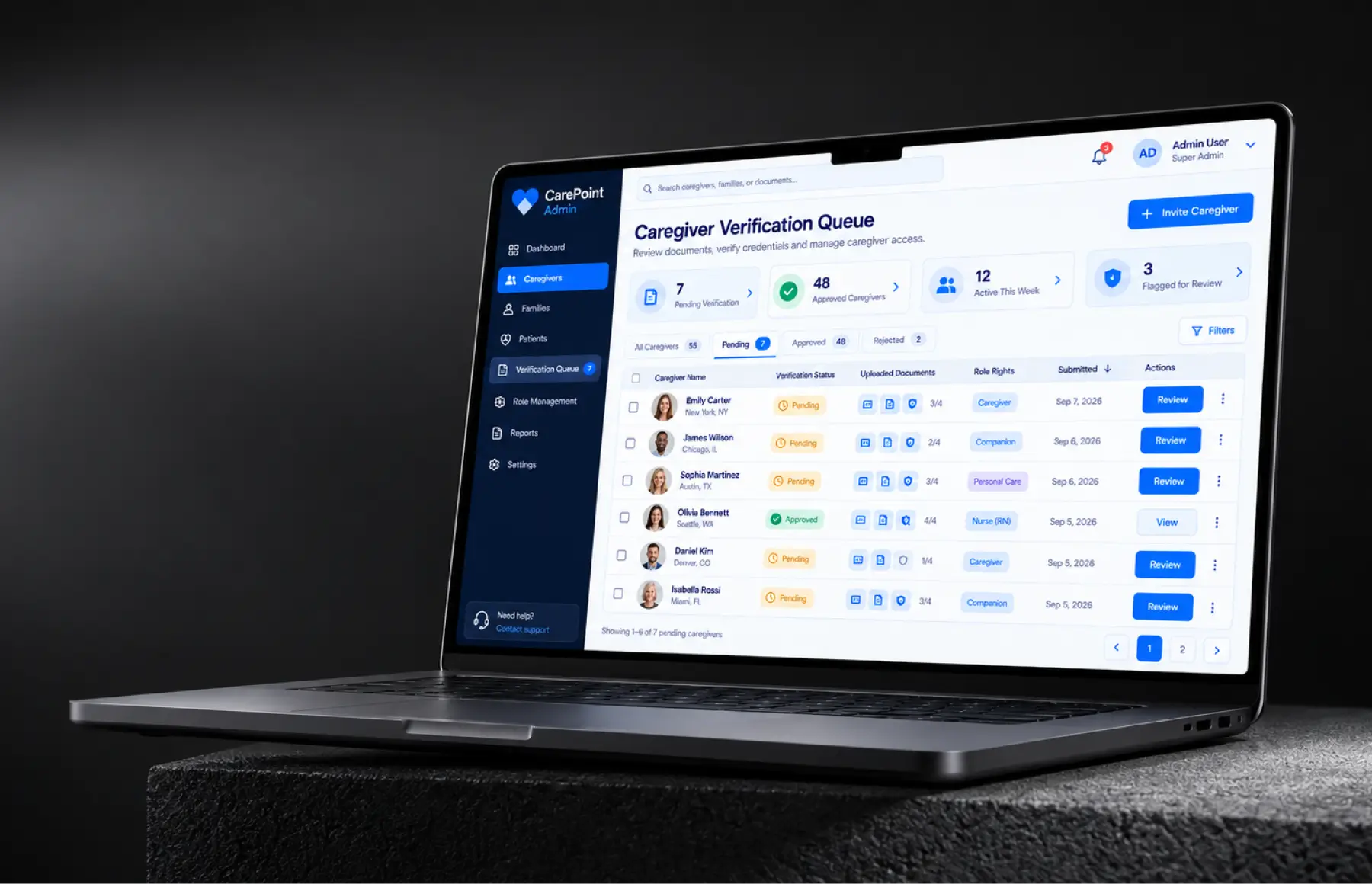
Around the records sits a care checklist, the task management layer of the senior care app. Every task carries a time, a member, a location, an issue (a toothache, a medication round, a mental health check-in), and a status: To Do, Done, or Skip. Caregivers close tasks from the phone. Families see the timestamp of the last update. The admin panel handles carer verification and role permissions.
None of this came from a template. Four roles with different rights, a filter set built for family care coordination, and a UI where the smallest text is 18 pt were all custom work. Off-the-shelf senior care software did not cover it.
Private Carer Search With Filters
Families filter fully trained carers and support workers by location, availability, and the type of personal care needed. Profiles show verification status, so a match takes hours rather than a week of agency calls.
Shared Health Records
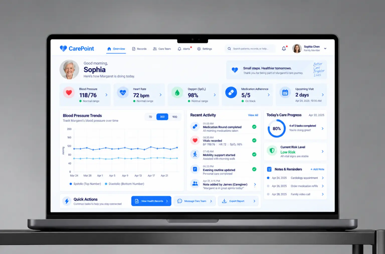
Care plans, health snapshots, vitals, medication records, and doctor visit notes live in one timeline for health monitoring across visits. Every record has a date range and structured details, so healthcare professionals reviewing them see a history, not a pile of notes.
Daily Care Checklist
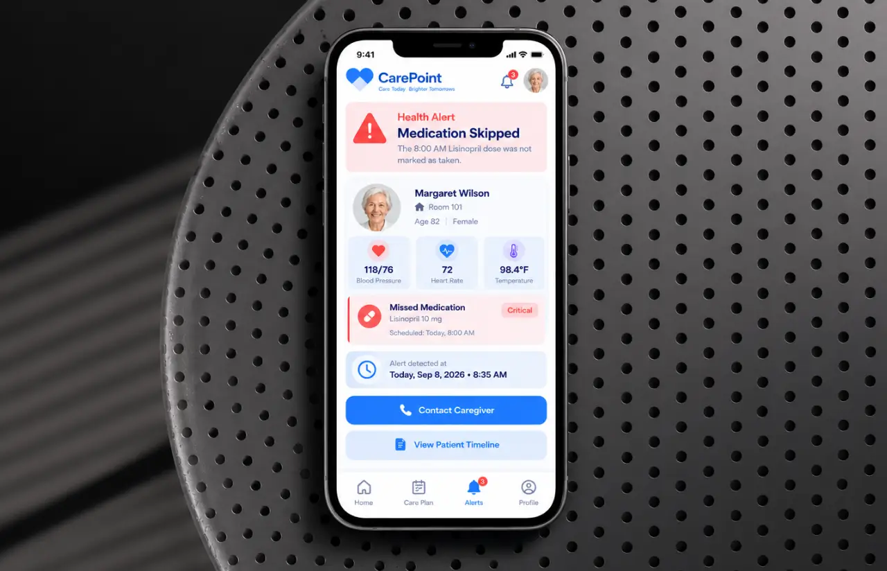
Tasks are scheduled by time and tied to a member, a location, and an issue. Caregivers mark them Done or Skip and add a note. A skipped 9:00 AM medication is visible to the family by 9:05.
Quick-Add Shortcuts
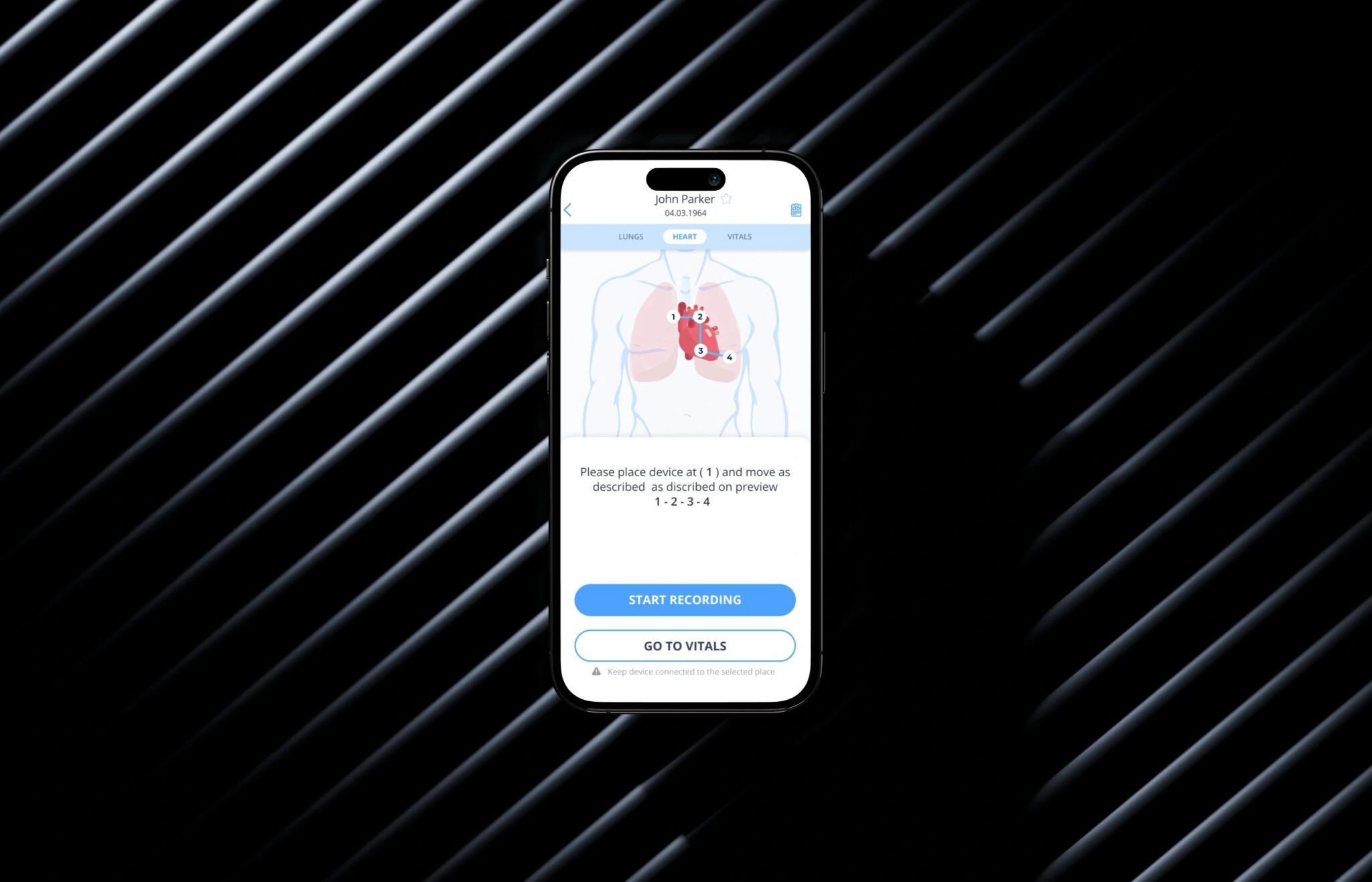
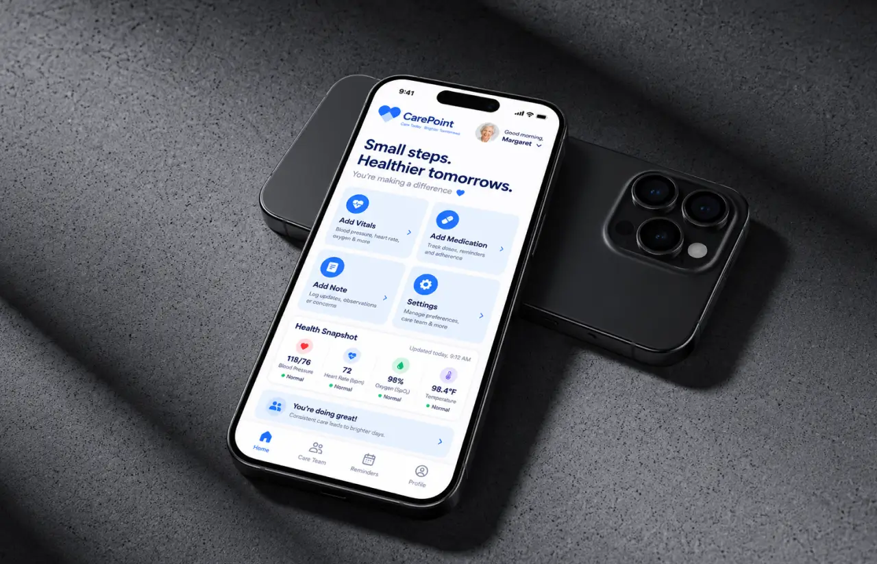
Four one-tap shortcuts sit on the home screen: add a note, update settings, add a vitals record, add a medication record. Users can create their own. Logging blood pressure takes under 30 seconds, even for someone new to health apps.
Medication Tracking and Reminders
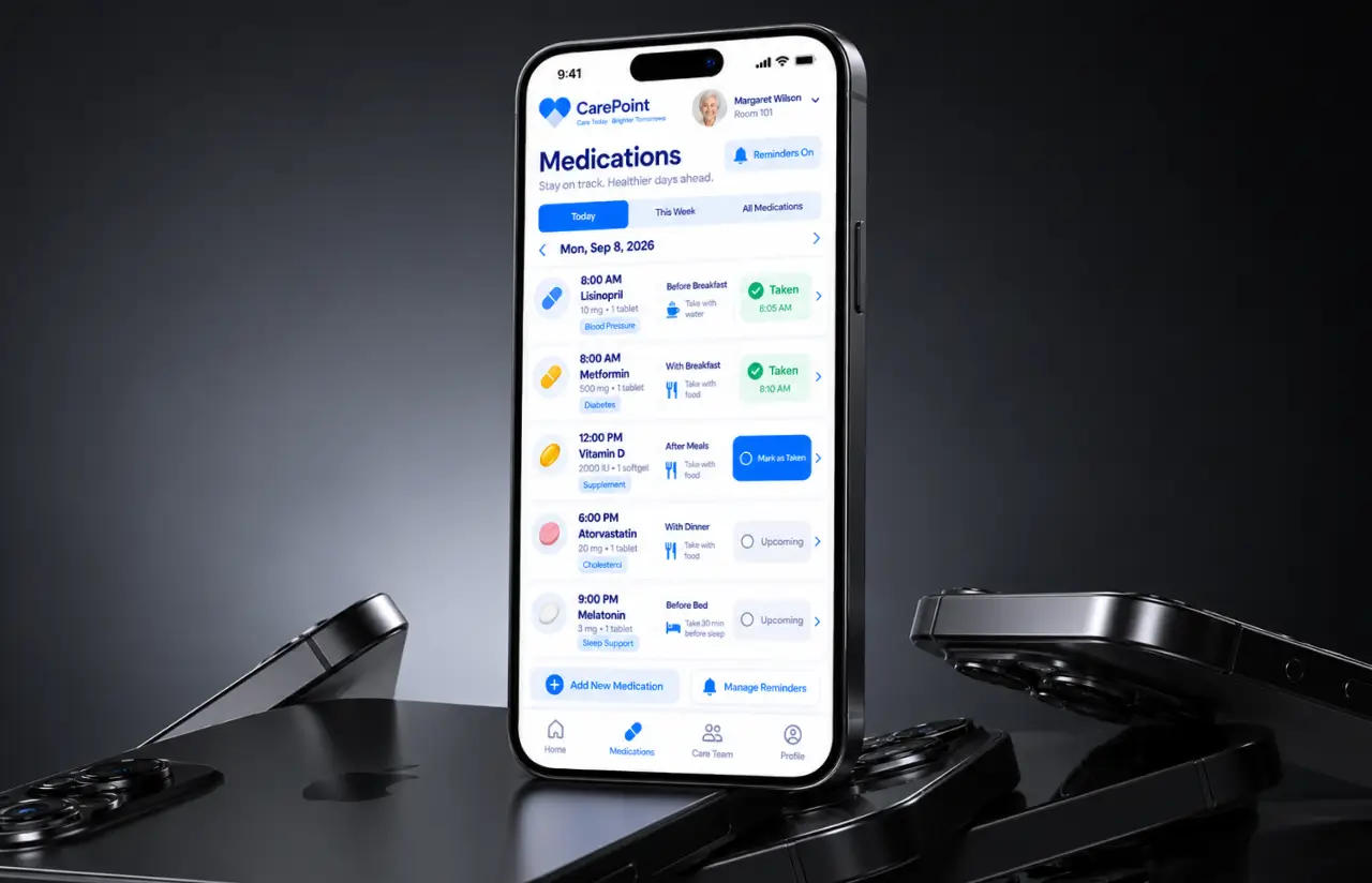
Each medication record stores dosage, frequency, and timing (2000 IU of vitamin D, once, after meals). Medication reminders go to the caregiver on duty and to the patient, so medication management stops depending on memory.
Role-Based Access for Four Roles
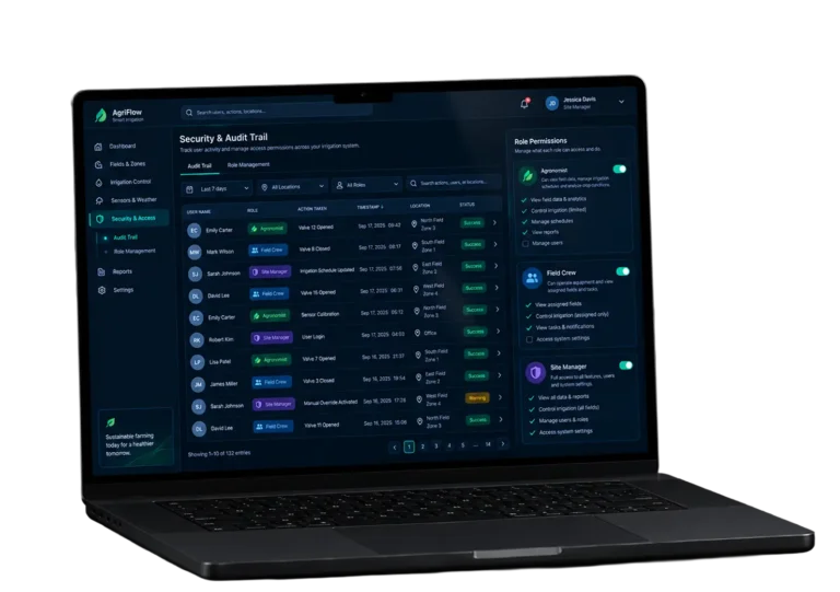
Patient, caregiver, family member, and admin each see a different app. A relative can read vitals but cannot edit a care plan. The admin approves carers. Permissions are enforced on the back end, not just hidden in the UI, so health data stays with the roles meant to see it.
Scrum Methodology
Project Journey
The care app development ran in two-week sprints, with the client reviewing a working build of the care app at the end of each one. Sprint 3 was the turning point: the founders tested an early build with two of their own parents, and the feedback pushed us to raise the minimum text size and rework the checklist table for phones. From there, the roadmap held steady, and 16 of 17 sprints shipped on the planned date.
How the Senior Care App Works
- A relative signs up, adds the patient's basic information, and sets what each role is allowed to see.
- Filters narrow verified carers by location, availability, and type of elder care needed. The family sends a request straight from the profile.
- The carer sees the personalized care plan, the daily checklist, and the patient's health snapshots before the first visit.
- Vitals, medications, and notes are logged with the senior care app's home-screen shortcuts. Each record is timestamped and tied to the caregiver who added it.
- Tasks move to Done or Skip with an optional note. Skips and flagged issues rise to the top of the family view.
- Health metrics and visit history show up in a large-type timeline on web or mobile, ready to share with healthcare providers at the next visit.
Development Process Flow
Discovery took two weeks and produced the four-role permission map and a clickable prototype tested with low-vision users before any Flutter code was written. Sprints 1 to 6 built the records module and back end, sprints 7 to 12 added the checklist, carer search, and admin panel, and the last five covered accessibility QA and store publishing. Our product design team stayed on the project through launch, keeping every new screen within the same accessibility rules.
How We Delivered the Caregiver App Project
- We define the project goal together, agree on priority features, and set a realistic delivery date and budget.
- We build a ranked list of everything the product needs, starting with what matters most to the business.
- Work is broken into 2-week cycles. At the start of each, we select the next set of features to deliver.
- The team builds, tests, and integrates features throughout the sprint.
- At the end of every sprint, you see working software and give feedback that shapes the next cycle.
- Each sprint produces a shippable piece of the product. We review what worked, adjust, and move forward.
Timeline
Five phases, clearly defined
Discovery & Workshop
- Comprehensive assessment of four roles and what each may read or edit
- Ranked essential features: records, checklist, carer search, admin
- Agreed the accessibility bar: 18 pt text, 56 px targets, AA contrast
Prototyping & Usability Tests
- Clickable Figma prototype of 22 screens
- Tested with 6 users over 65, three with poor eyesight
- Cut the sign-up flow from 7 steps to 4
Agile Development
- 17 two-week sprints, demo at the end of each
- Records and back end first, then checklist, search, admin
- Sprint 3 parent test reshaped the mobile checklist
QA & Accessibility Testing
- Screen reader pass on iOS and Android
- Contrast and tap-target audit on every screen
- Regression on 9 phone models and 3 browsers
Launch & Support
- App Store and Google Play publishing handled by LITSLINK
- Web app and admin panel released the same week
- Monitoring and fixes through the first 90 days
UI/UX Design: Accessibility-First Interface for Senior Care
The client’s brief for the interface was one sentence: “My mother should be able to use this without her glasses.” We treated that as a spec. Body text starts at 18 pt, buttons are at least 56 px tall, and every interactive element sits 16 px from its neighbor, so a shaky tap lands where it was meant to. A senior app lives or dies on details like that.
Color does the rest. The palette is three colors: blue (#2F80ED), white, and light blue (#D3E4FB). Blue marks anything tappable. Light blue marks selected or active states. White is content. Every text-and-background pair passes WCAG AA contrast, and the checklist shows status with a color, a filled radio button, and a text label, so a user with color-vision loss can still read it.
Tables were the hardest part of the elder care UI. The care checklist on the web has five columns. On a phone, the care app shows one card per task with the status buttons stacked vertically. Data-heavy views like the records list use bold labels (“Start Date,” “Summary,” “Details”) with the value on the same line, which tested better with senior citizens than a two-column layout.
For the client, the design work had a business result: fewer support calls. In the first month after launch, most requests for human support came from caregivers asking about verification documents, not from patients or families asking how to find a screen.
Results
Before
- ✕Finding a carer took 5 to 7 days of calls to elder care agencies.
- ✕Records were split across paper folders, phone notes, and memory.
- ✕Families learned about skipped medication days later, if at all.
- ✕Existing health apps failed the founders' own low-vision test.
- ✕No single interface connected patients, caregivers, and families.
After
- ✔Under 48 hours from search to a matched carer for the pilot group.
- ✔One timeline for vitals, medications, care plans, and visit notes.
- ✔Under 5 minutes from a skipped task in the care app to a family notification.
- ✔100% of screens pass WCAG AA contrast, with 18 pt minimum text.
- ✔Four roles, one back end, shared by web, iOS, and Android.
Impact of the Senior Care Platform After Launch
Verified Reviews
Our Reputation on Top Platforms
LITSLINK holds a 4.8 rating on top platforms, with clients regularly pointing to communication and on-time delivery on healthcare app development projects. Healthcare organizations and startups come to us for healthcare software and other digital health solutions because we build multi-role access, consent, and data security into every project.
Have a Healthcare App Project in Mind?
Planning senior care app development or a remote patient monitoring tool for older adults? Tell us who your users are and what they struggle with today. Our mobile app development team has shipped healthcare apps on both stores and will come back within 48 hours with a first take on scope and timeline.
Thank you for your message. It has been sent.